Revive
"Revive is a skincare brand focused on restoration, balance, and gentle confidence through calm visual language and considered product presentation.".
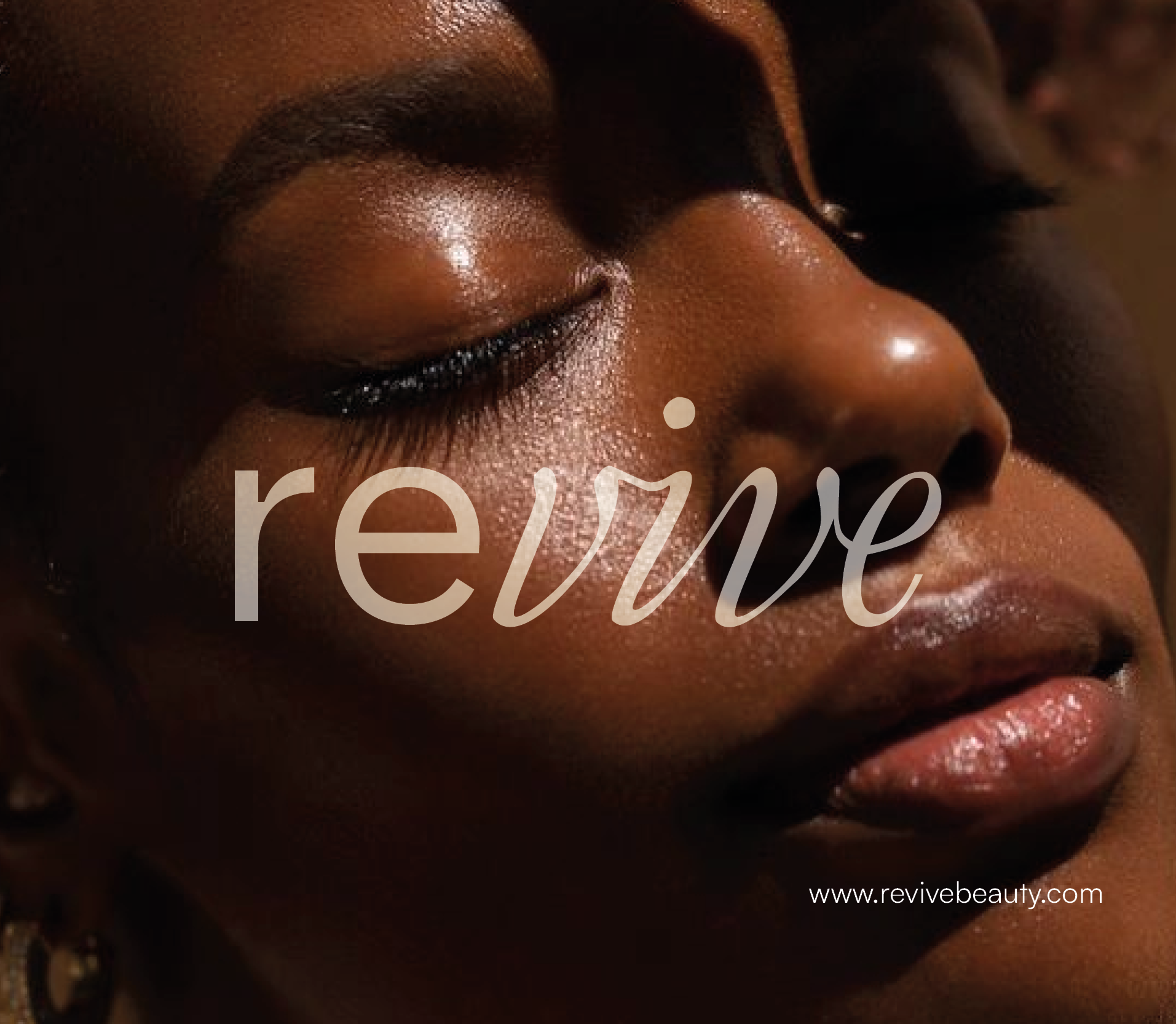
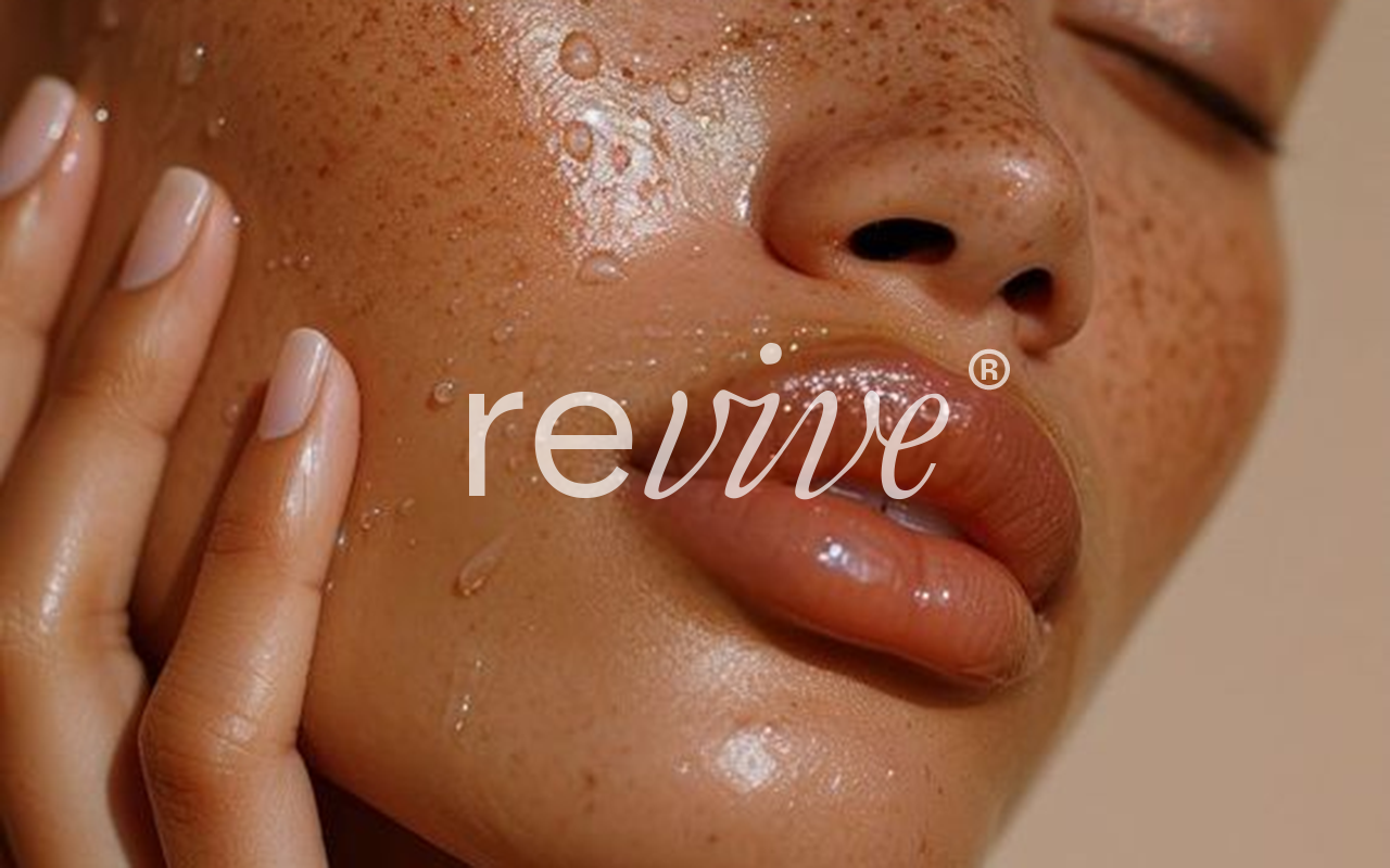
Revive is a skincare identity built around softness, clarity, and emotional reassurance. The brand avoids loud natural symbolism and instead communicates care through restrained colour, typography, and layout decisions. Every design choice was made to support a feeling of calm confidence rather than trend‑driven beauty. The system demonstrates how subtlety can be powerful in wellness branding, allowing the products to feel trustworthy, contemporary, and emotionally considered. Revive positions skincare not as cosmetic performance, but as a daily ritual of care, balance, and quiet confidence.
"".
Revive was designed to express care through restraint. Rather than relying on literal natural symbols, the identity communicates calm through spacing, colour softness, and typographic balance. The nude and muted blue tones suggest clarity, cleanliness, and emotional comfort. This approach allows the brand to feel modern, trustworthy, and emotionally intelligent. The visual system avoids excess decoration, ensuring that attention remains on the product experience itself. Revive positions skincare as a moment of personal reset rather than performance. The identity reflects a belief that beauty is not loud or complex, but gentle, intentional, and quietly confident.

"Softness is not weakness. It is clarity, care, and quiet confidence.".
"".
"".
"".
"".
"".
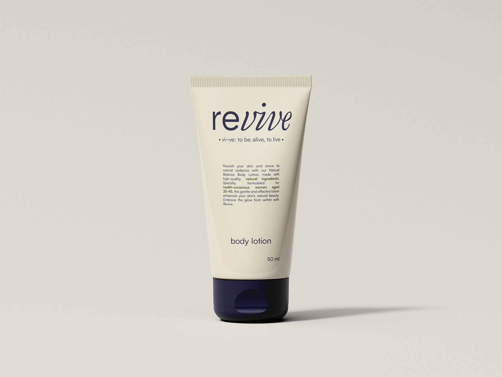
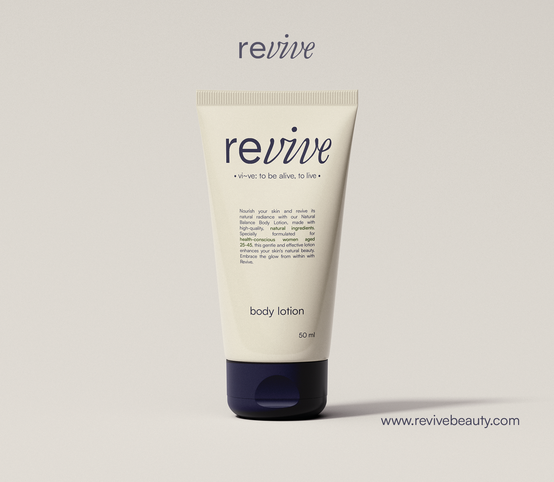
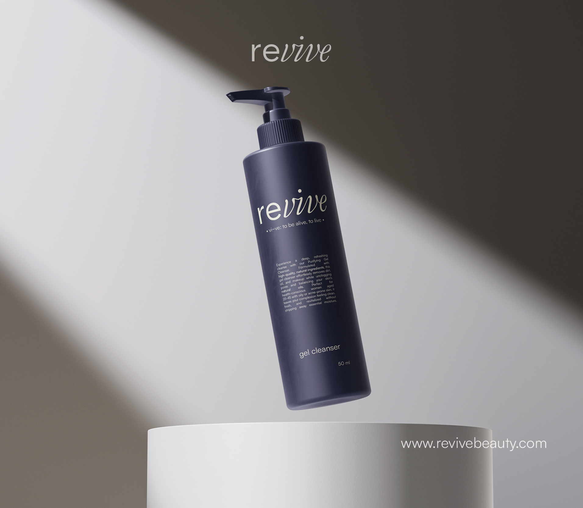
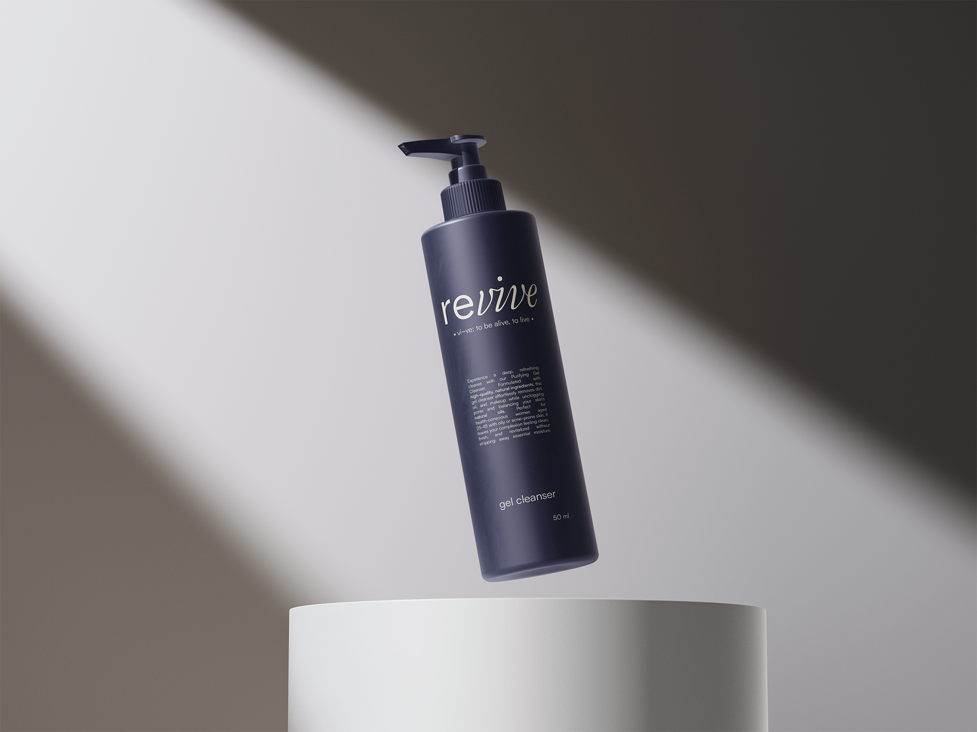
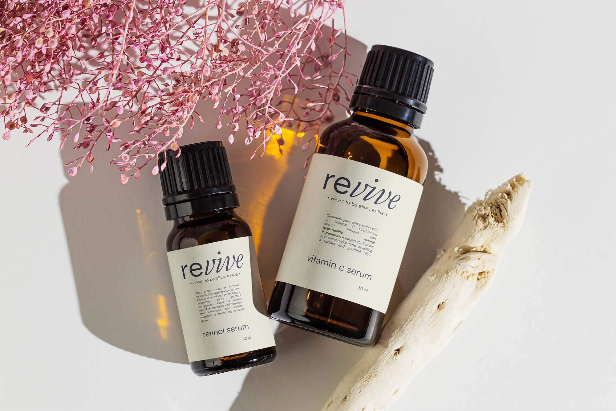
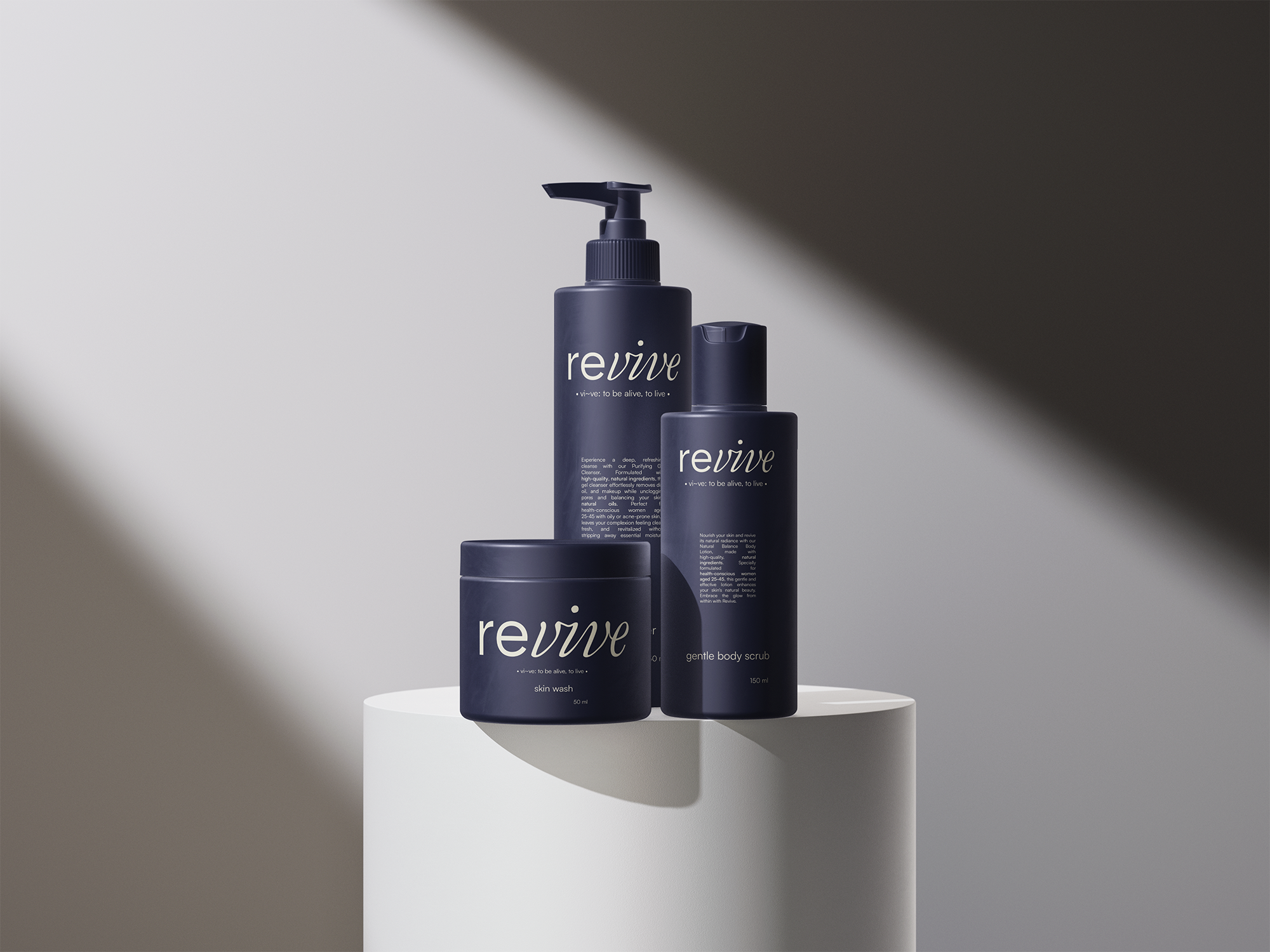
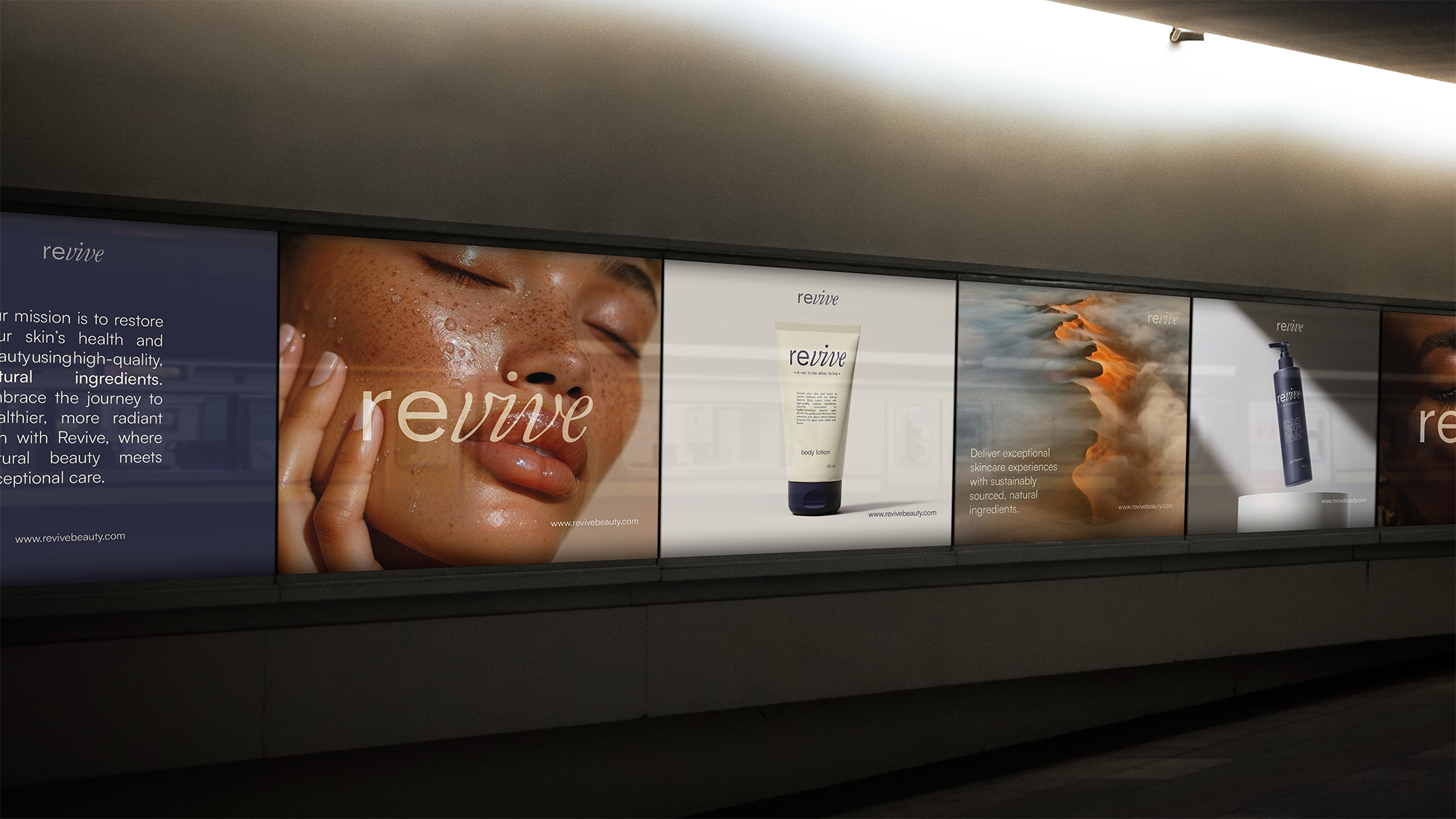
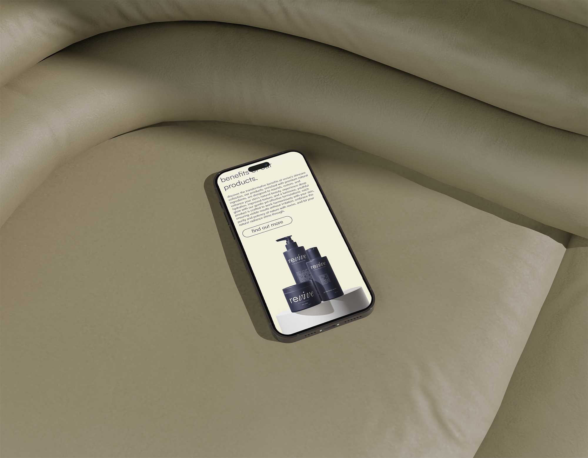
The product visuals focus on form, material honesty, and compositional calm. Each bottle and container is positioned to feel approachable rather than aspirational. Lighting is soft, shadows are controlled, and reflections are subtle. This reinforces the idea that Revive is about everyday care rather than luxury performance. The packaging allows the product to feel both contemporary and emotionally safe. By avoiding visual noise, the brand encourages trust and long‑term connection rather than impulse consumption.
"Every detail exists to support calm, not compete for attention.".
"".
"".
"".
"".
"".
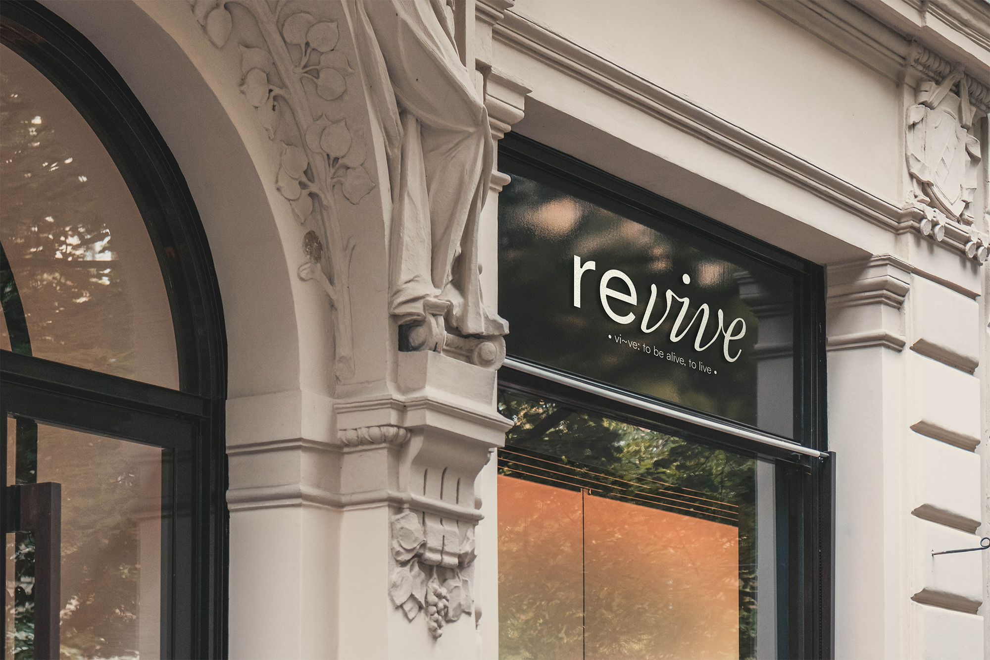
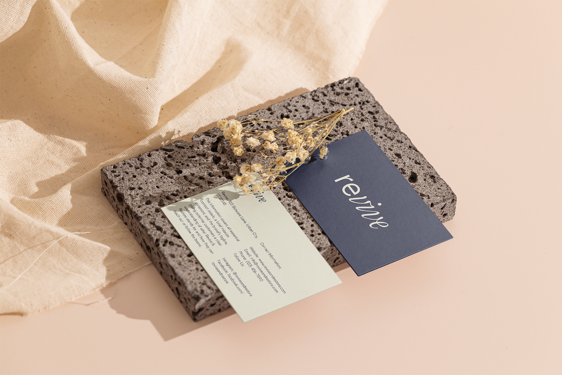
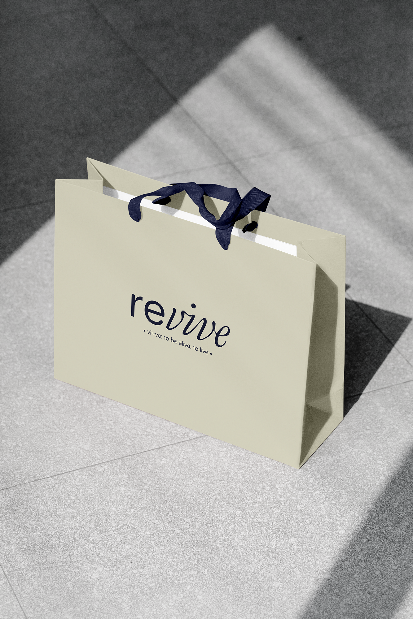
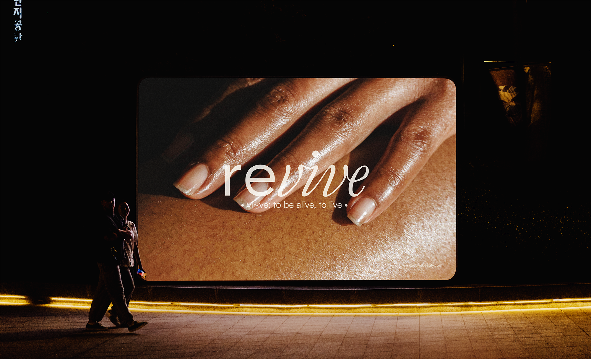
Print and physical touchpoints extend the digital identity into real‑world interaction. Business cards, bags, and banners maintain the same typographic hierarchy and colour restraint. These materials allow Revive to exist consistently across physical and digital environments. The goal is familiarity rather than novelty. Each piece feels like part of the same conversation, reinforcing trust and recognition through repetition.
"".
"".
"".
"".
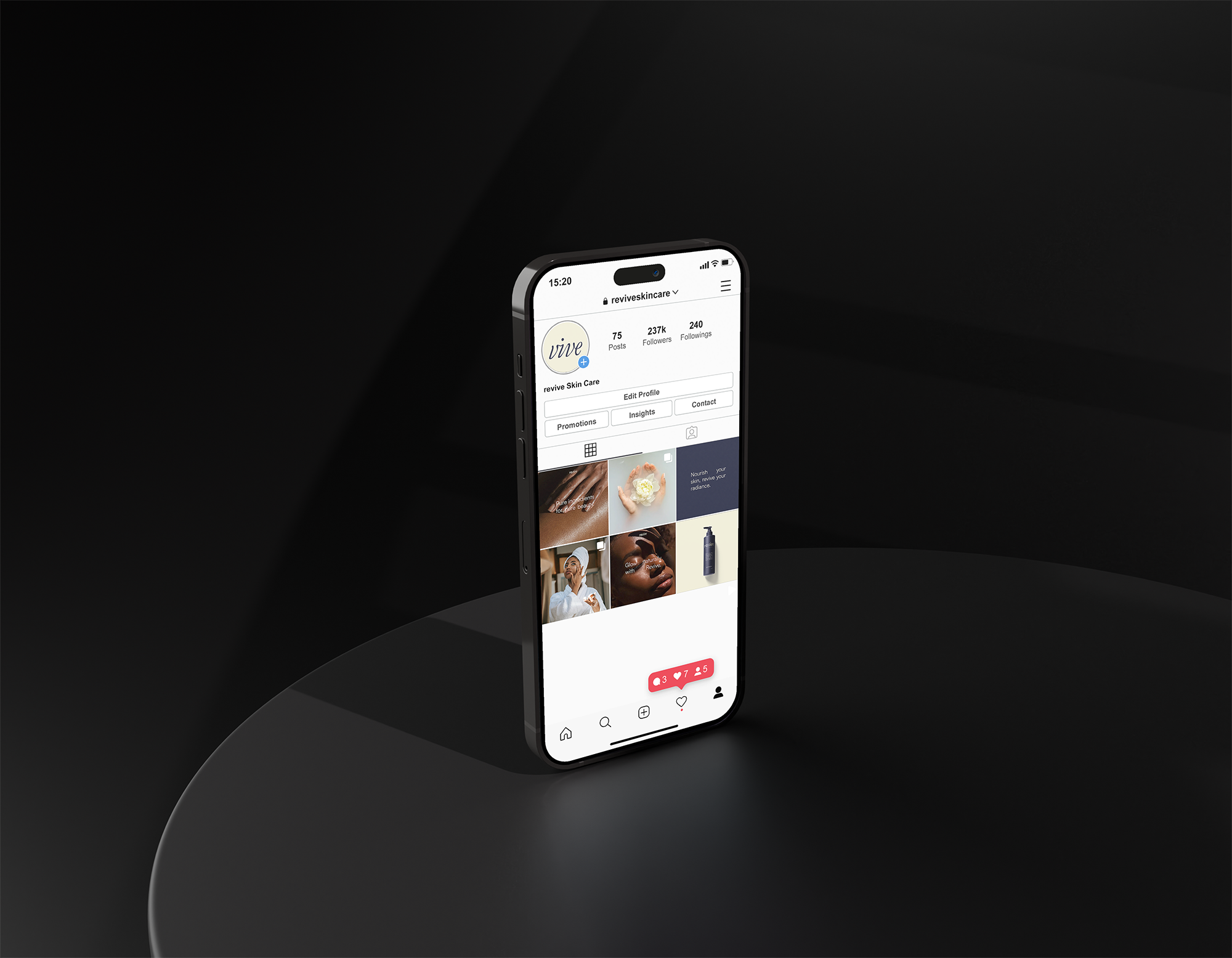
"Digital spaces should feel as calm as the product itself.".
"".
"".
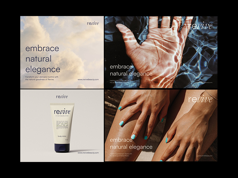
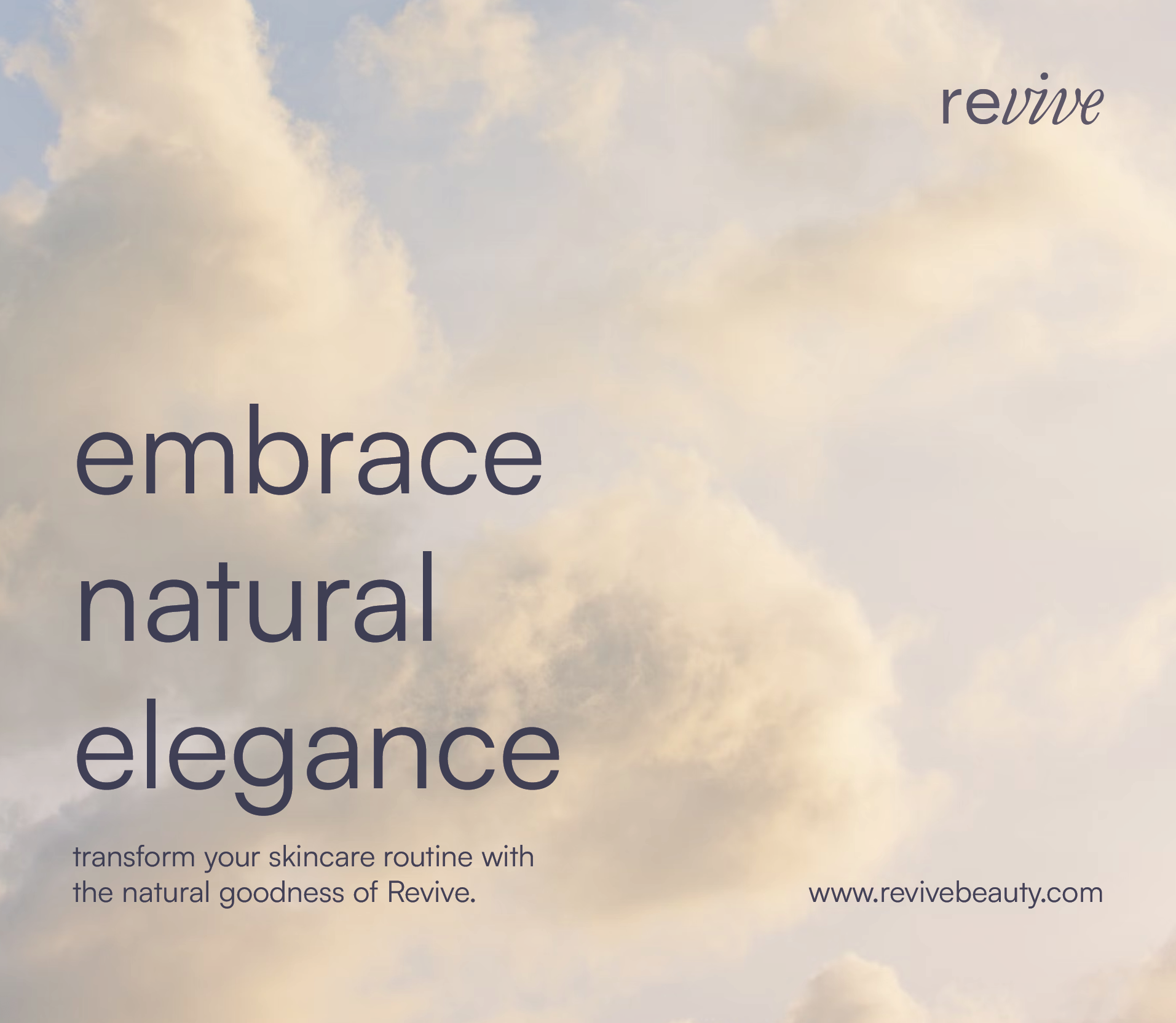
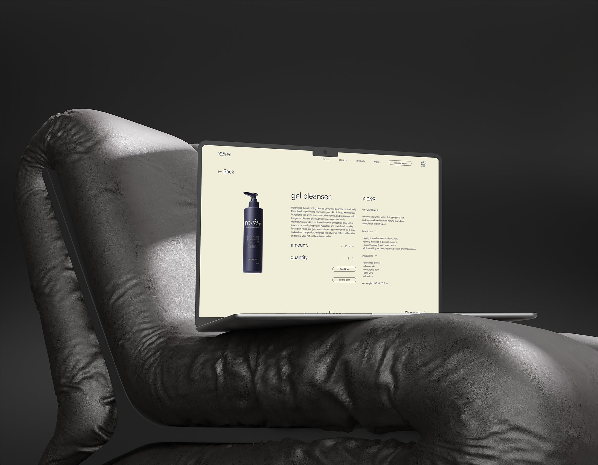
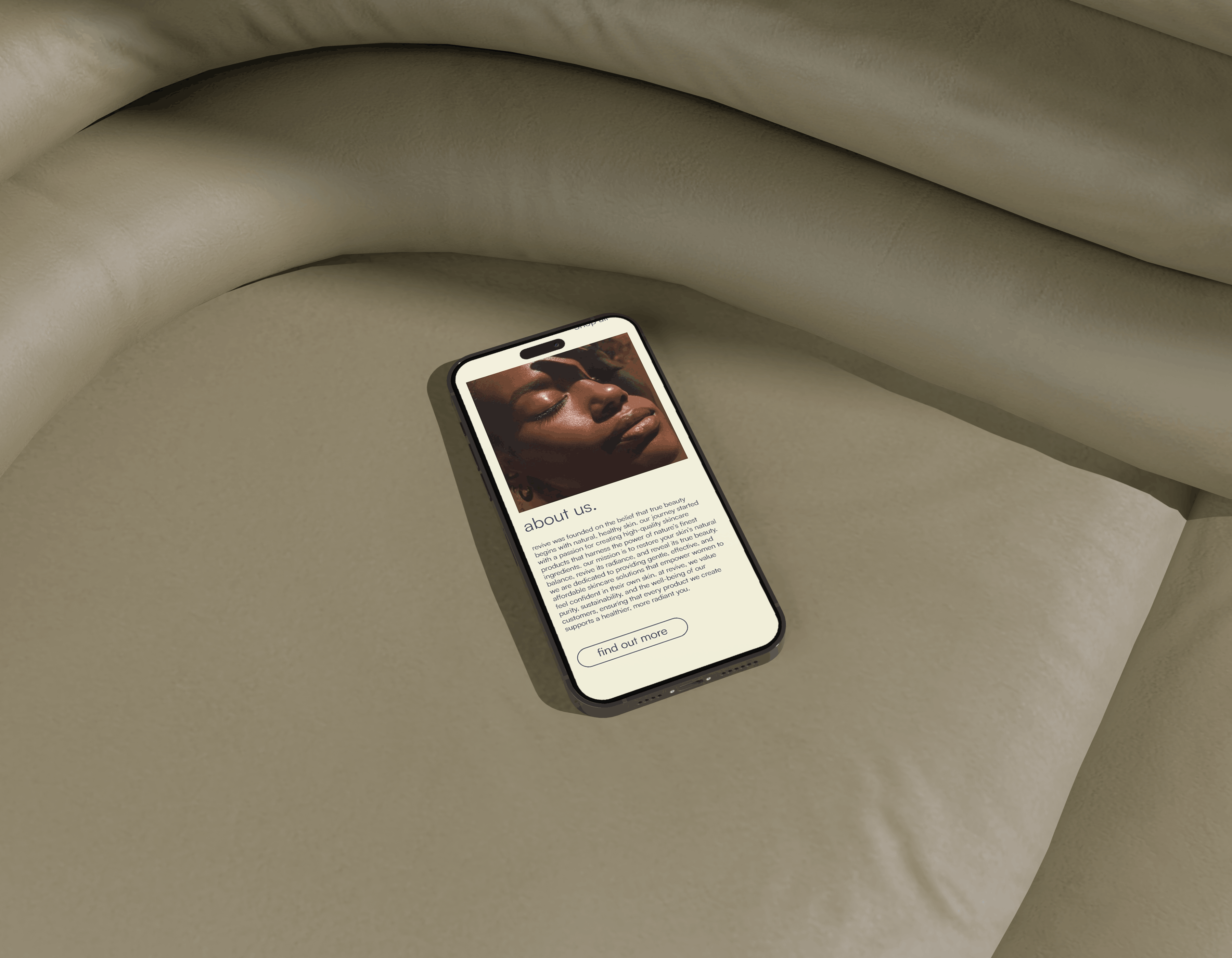
The website experience prioritises ease, rhythm, and emotional clarity. Layouts guide the user gently rather than forcing interaction. Typography spacing, button placement, and colour contrast are all designed to reduce friction and encourage exploration. The interface mirrors the product philosophy: simple, caring, and calm. The site becomes an extension of the brand’s emotional tone rather than a separate digital system.
"".
"".
"".
"A brand is proven when it survives outside the screen.".
"".