Project(32)
"Project 32 explores fashion as a structured brand system, combining identity, clothing, and digital presence into a cohesive visual language.".
Project 32 is a fashion identity system built around clarity, hierarchy, and controlled expression. The project focuses on how branding can translate consistently across garments, packaging, digital platforms, and promotional media. Rather than relying on trend-driven aesthetics, Project 32 prioritises structure, rhythm, and recognisability. Each design decision was guided by the intention to create a long-term visual system that could evolve without losing its core identity. The project demonstrates how fashion branding can operate as a cohesive ecosystem rather than a collection of isolated visuals.
"Design becomes meaningful when intention remains visible in every detail.".

"".
Project 32 explores fashion as a system of identity rather than a collection of isolated visuals. The brand was designed to balance confidence with restraint, ensuring that every element felt intentional rather than decorative. Typography, spacing, and layout were treated as structural tools that guide how the audience reads and understands the brand. Rather than relying on trends, the system focuses on clarity, repetition, and adaptability. This approach allows Project 32 to remain consistent across garments, packaging, and digital platforms while still leaving room for evolution. The goal was to create a brand that feels controlled, recognisable, and long-lasting.
"".
"".
"".
"".
"".
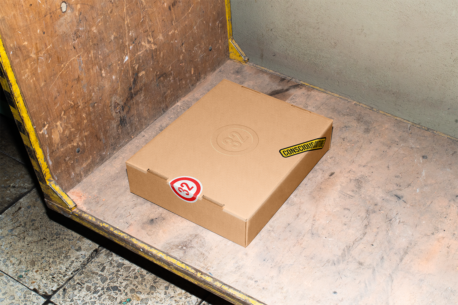
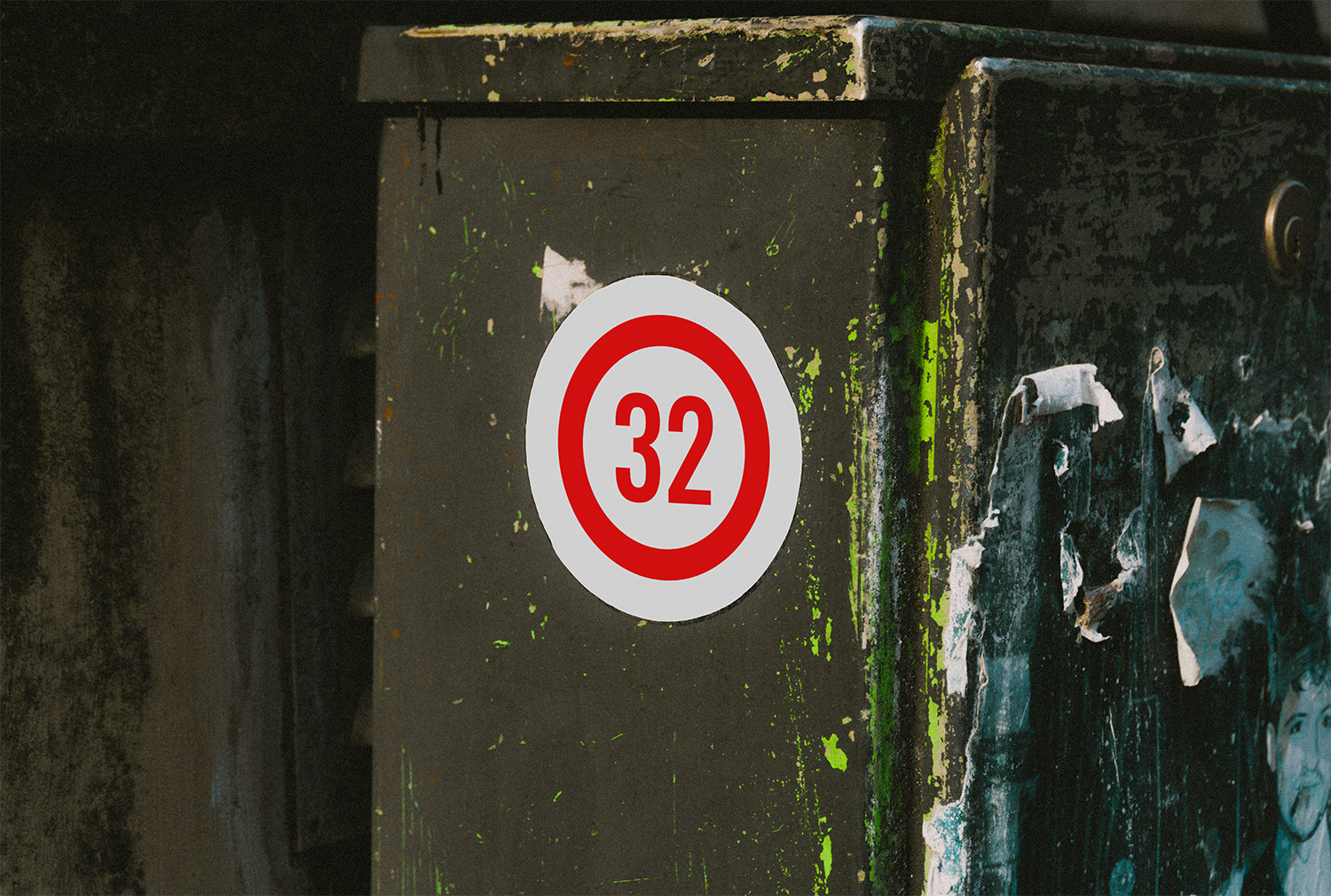
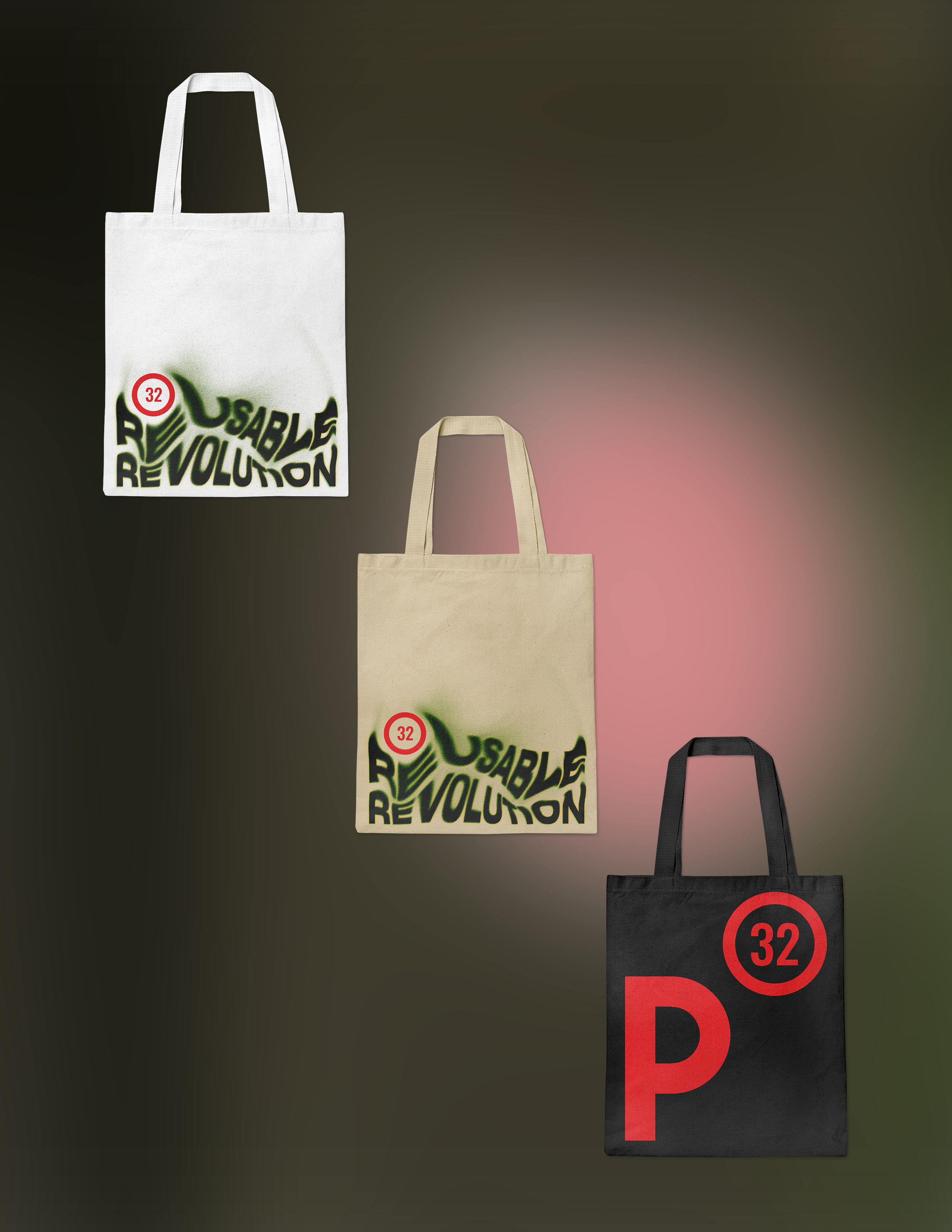
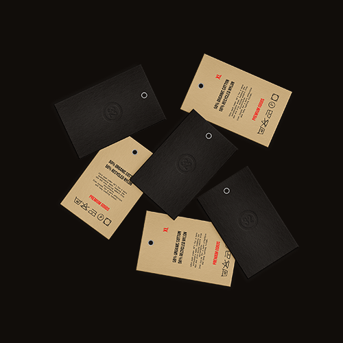
Brand applications were designed to reinforce recognition through repetition and consistency. Each touchpoint carries the same structural language, ensuring that Project 32 remains identifiable regardless of format. Packaging, accessories, and printed materials operate as extensions of the same visual system rather than independent designs.
"".
"".
"".
"".
"".
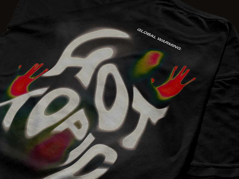
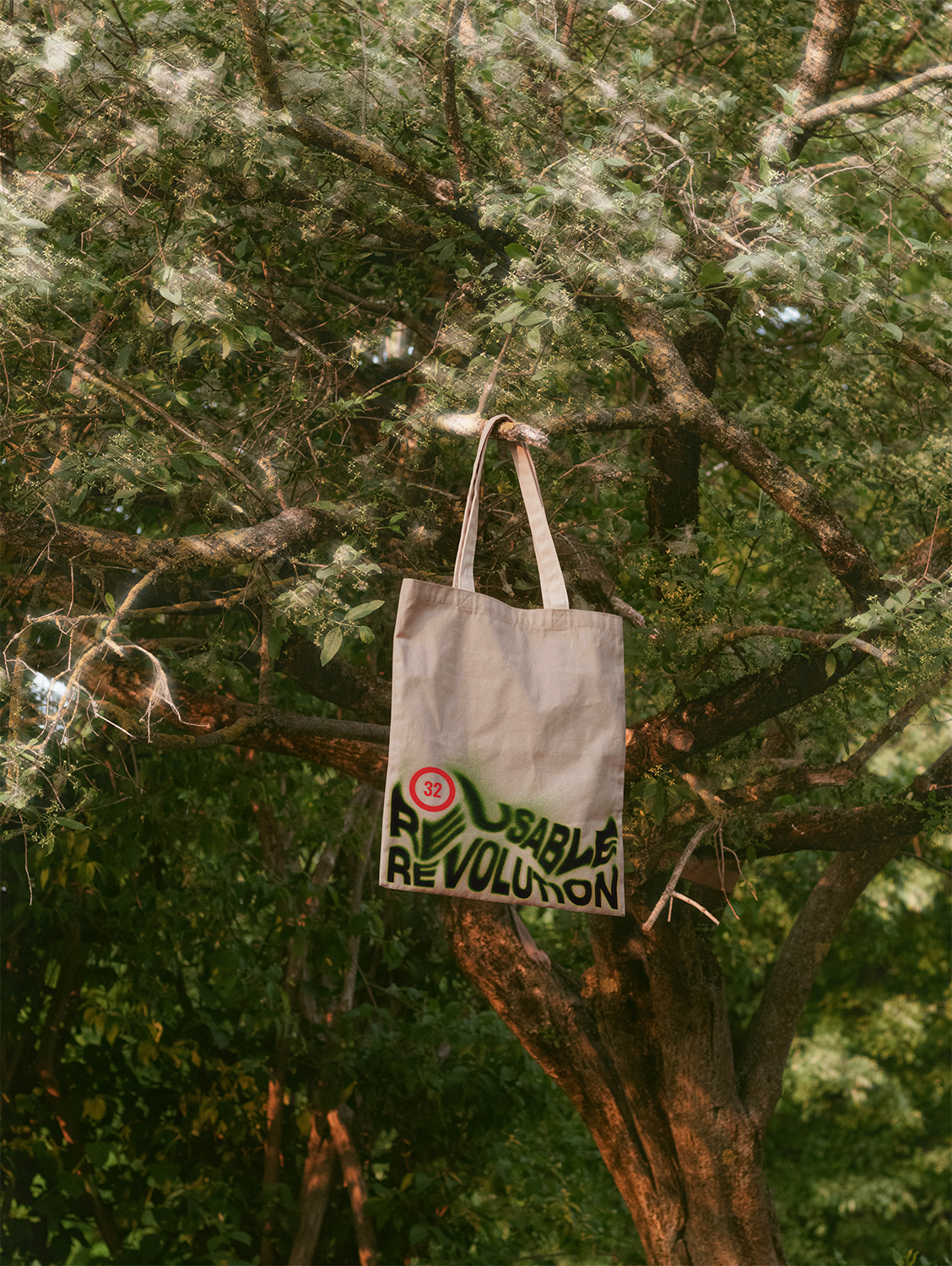
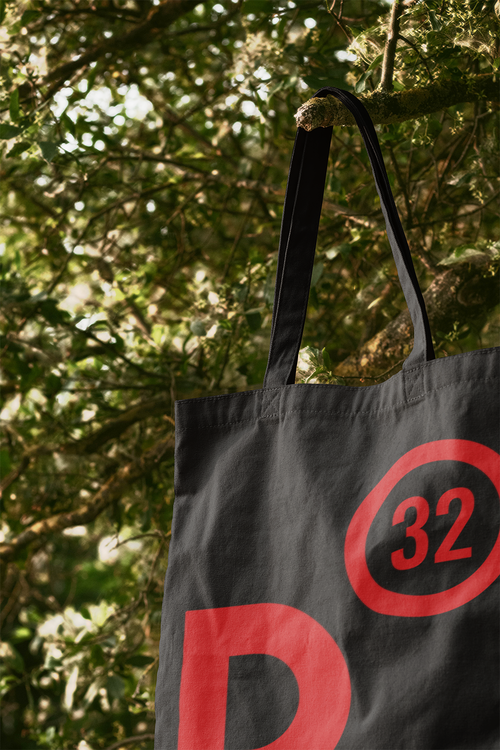
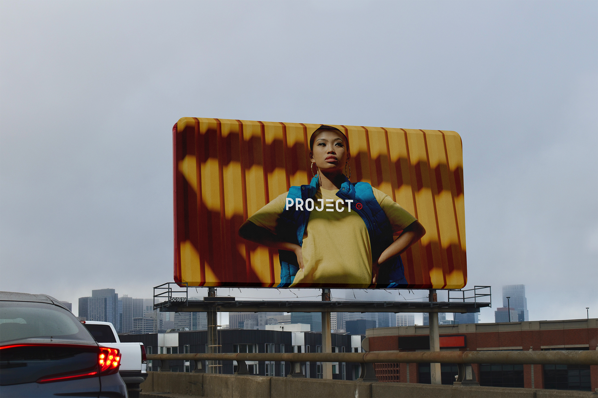
The garments were designed to act as moving canvases for the brand language. Print placement, tag positioning, and scale were carefully considered to ensure balance between statement and wearability. Rather than overwhelming the garment, the graphics support form and movement. This approach allows the clothing to communicate identity without sacrificing comfort or versatility.
"".
"".
"".
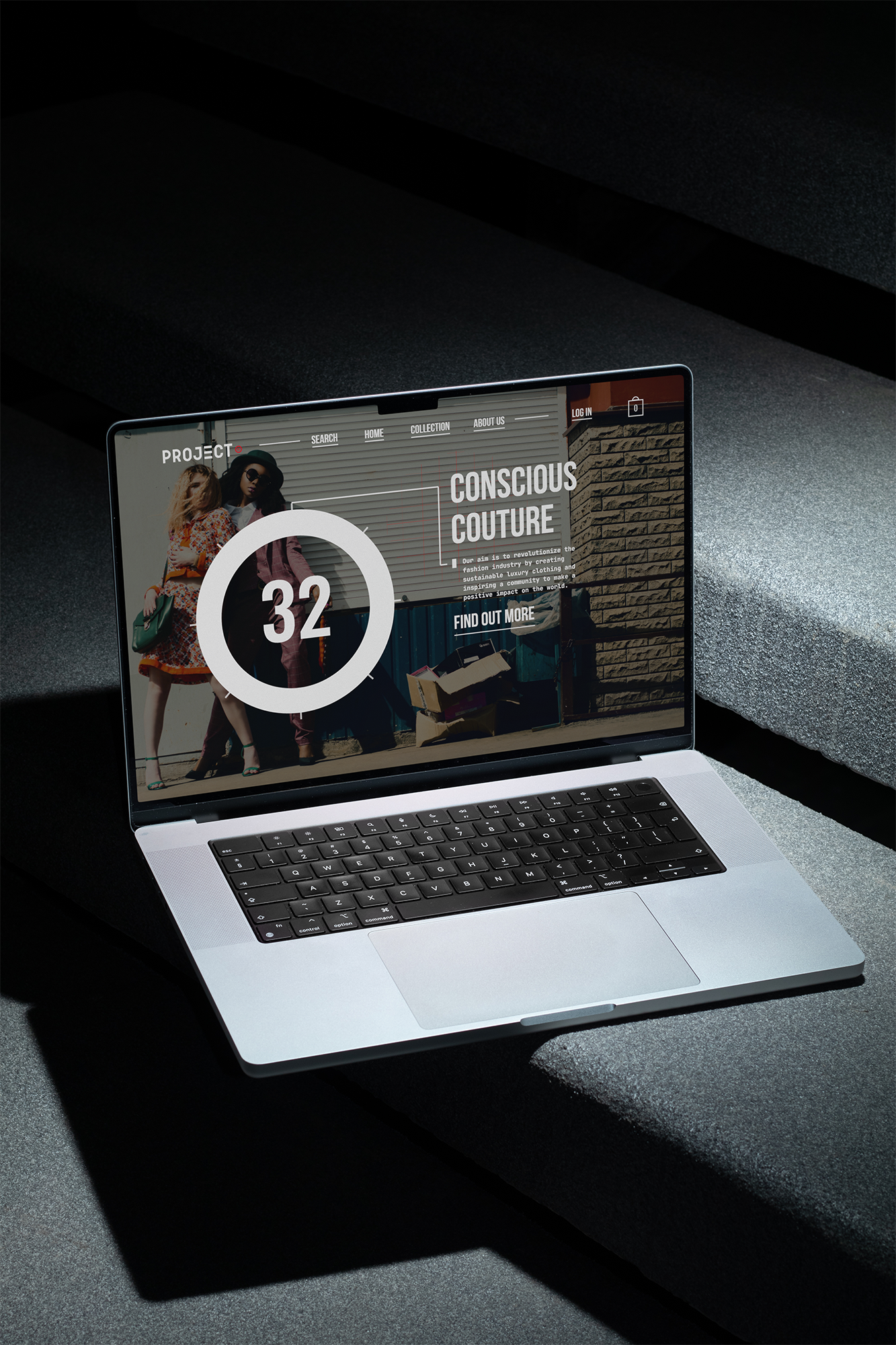
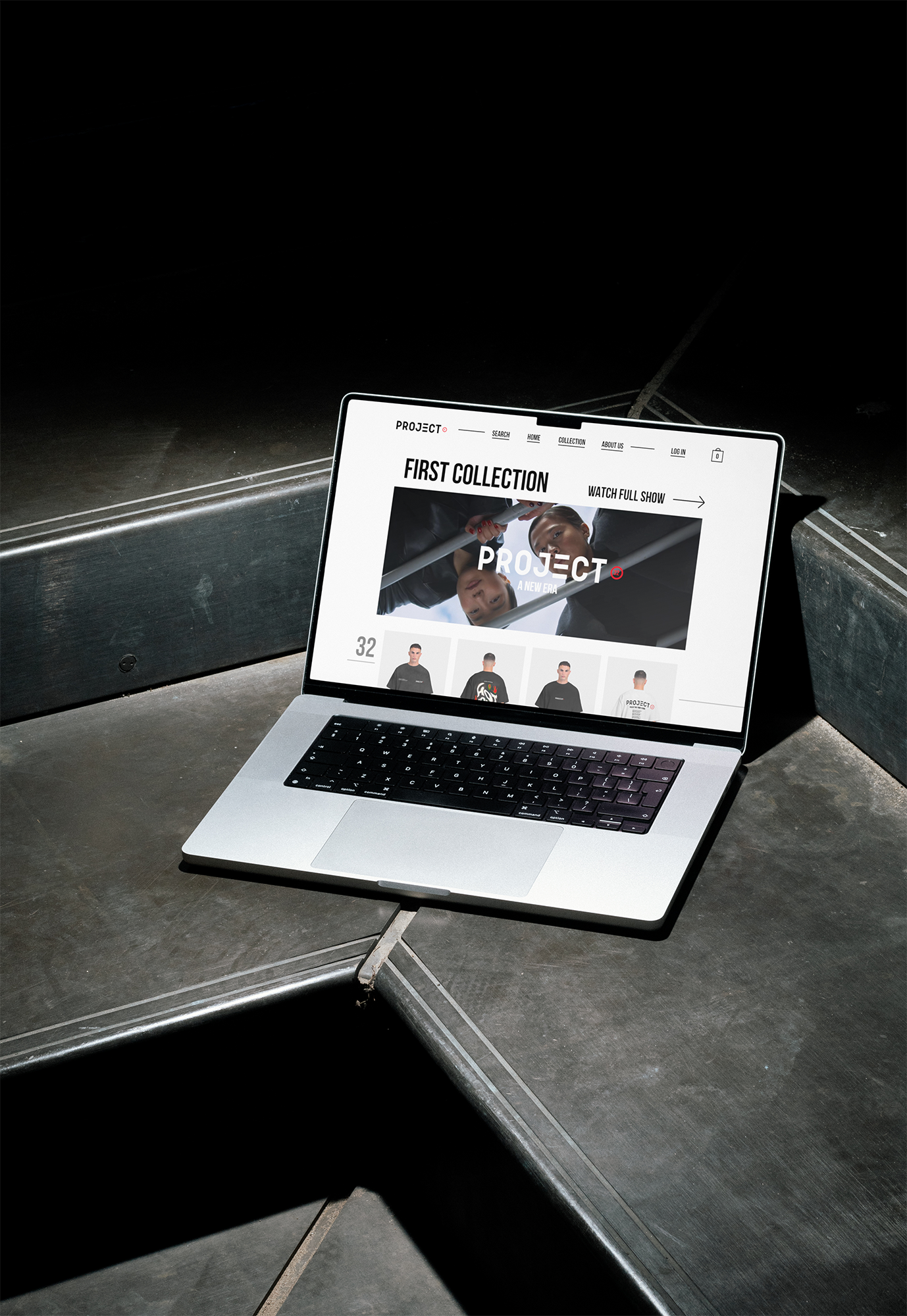
The website translates the physical brand language into a digital environment. Spacing, hierarchy, and pacing mirror the same discipline used in print and garment design. Navigation is structured to feel intuitive rather than forced, allowing users to explore content without friction. The website operates as a continuation of the brand rather than a separate interface.
"".
"".
"".
"".
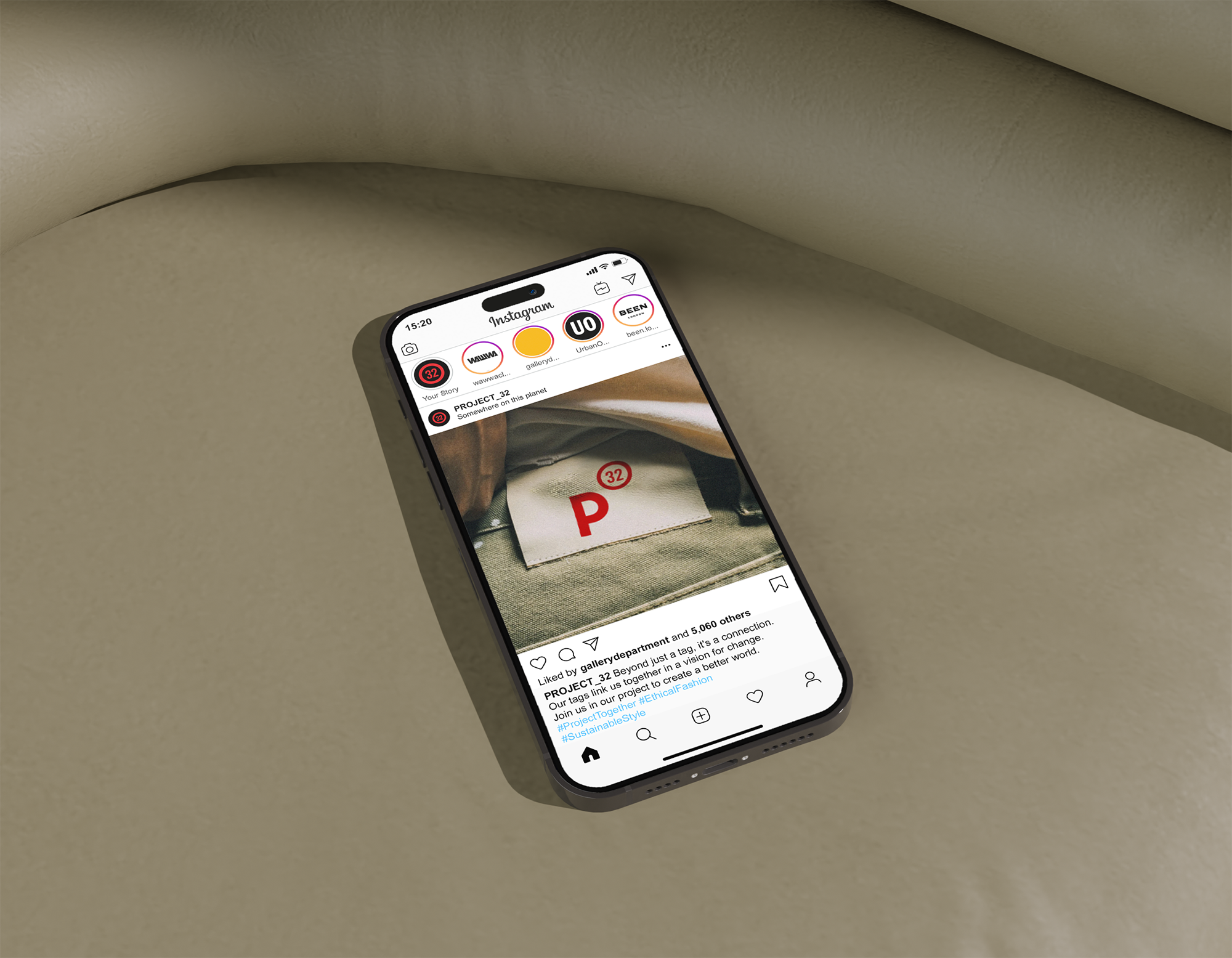
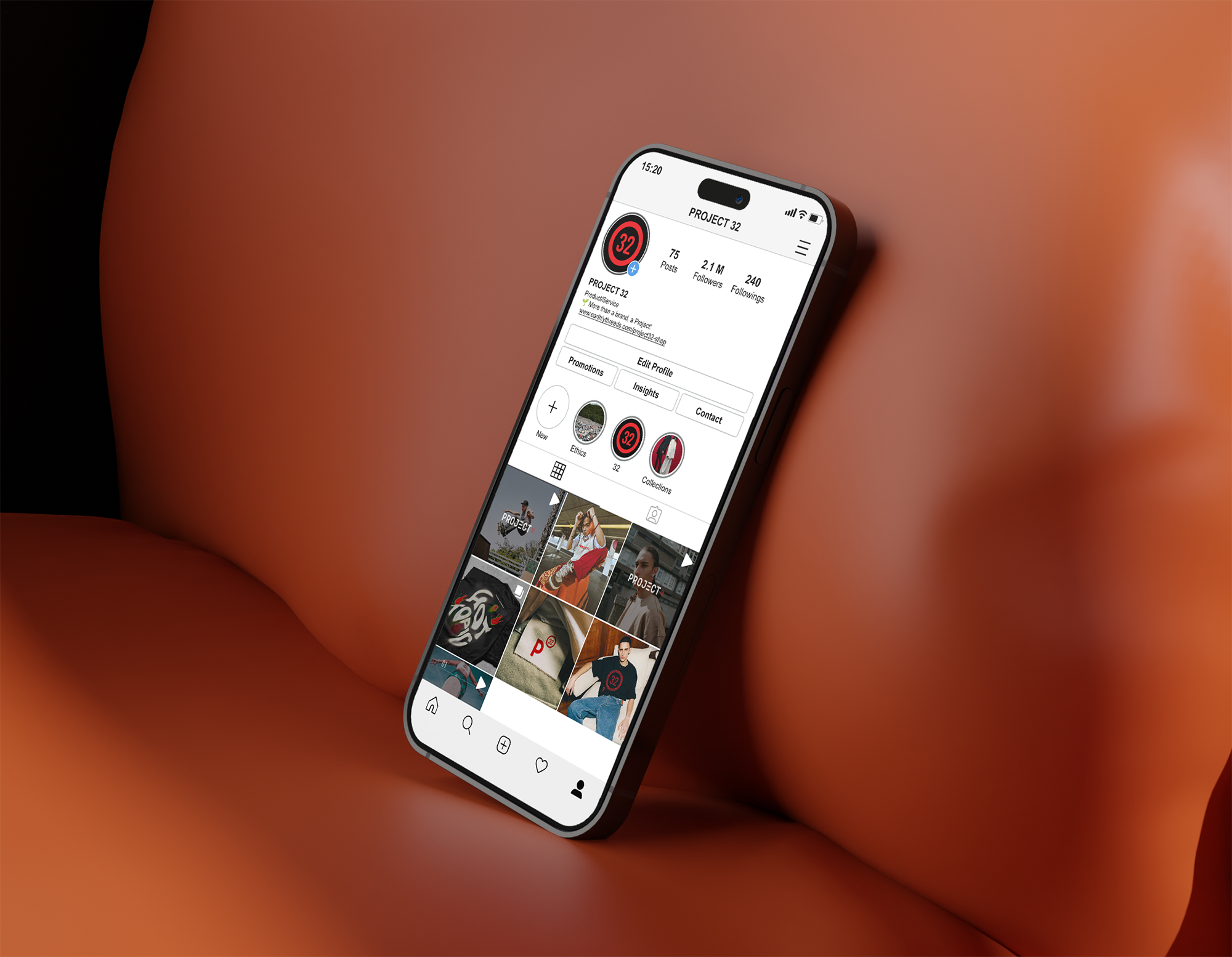
Social and promotional visuals maintain the same controlled hierarchy as the core brand system. Rather than chasing trends, the layouts prioritise clarity, rhythm, and recognisability. This ensures that the brand remains consistent across fast-moving platforms while preserving its identity.
"".
"Design is successful when it remains clear, even as it evolves.".