Artist Residence
"A hospitality brand rooted in creativity, community, and lived-in character.".
Artist Residence is a boutique hospitality brand built around warmth, creativity, and human connection. The identity balances eccentric charm with thoughtful restraint, allowing art, texture, and storytelling to shape environments that feel both personal and inviting. Rather than relying on polished luxury, the brand leans into authenticity, celebrating imperfections, local culture, and the feeling of a home away from home. The work explores how graphic systems, print applications, and layout decisions support this ethos across physical touchpoints, reinforcing Artist Residence as a space where design, community, and hospitality naturally intersect.
"A space feels authentic when design supports the atmosphere rather than competing with it.".

"".
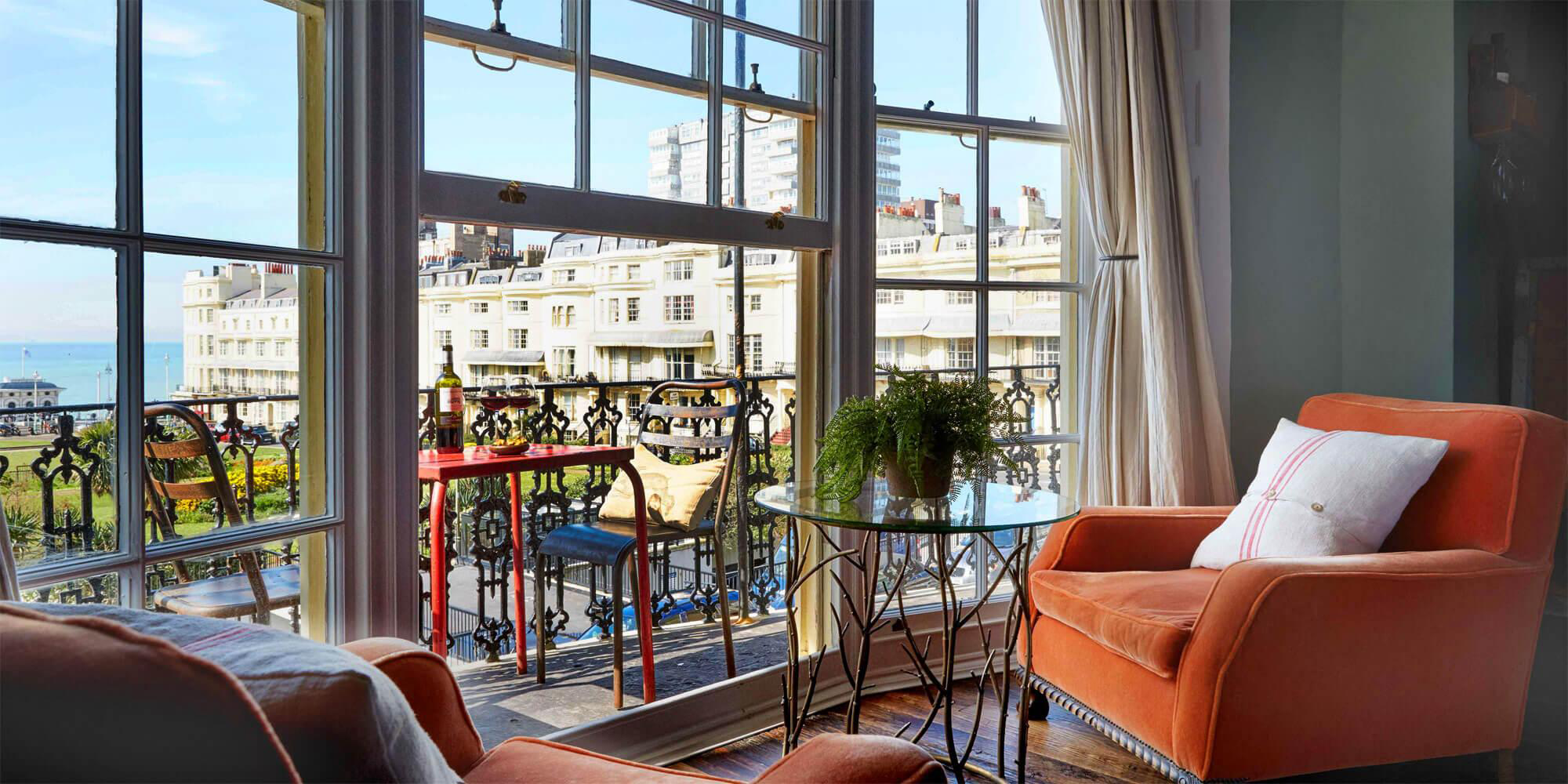
Artist Residence is defined by warmth, informality, and character. The design work shown throughout this project does not attempt to reinvent the brand, but instead works within existing guidelines to amplify what already exists: a sense of place, personality, and lived-in comfort. Design decisions are made to feel supportive rather than dominant, allowing materials, typography, and composition to quietly reinforce the brand’s hospitality-led ethos.
"In a hospitality setting, print should feel discovered, not announced.".
"".
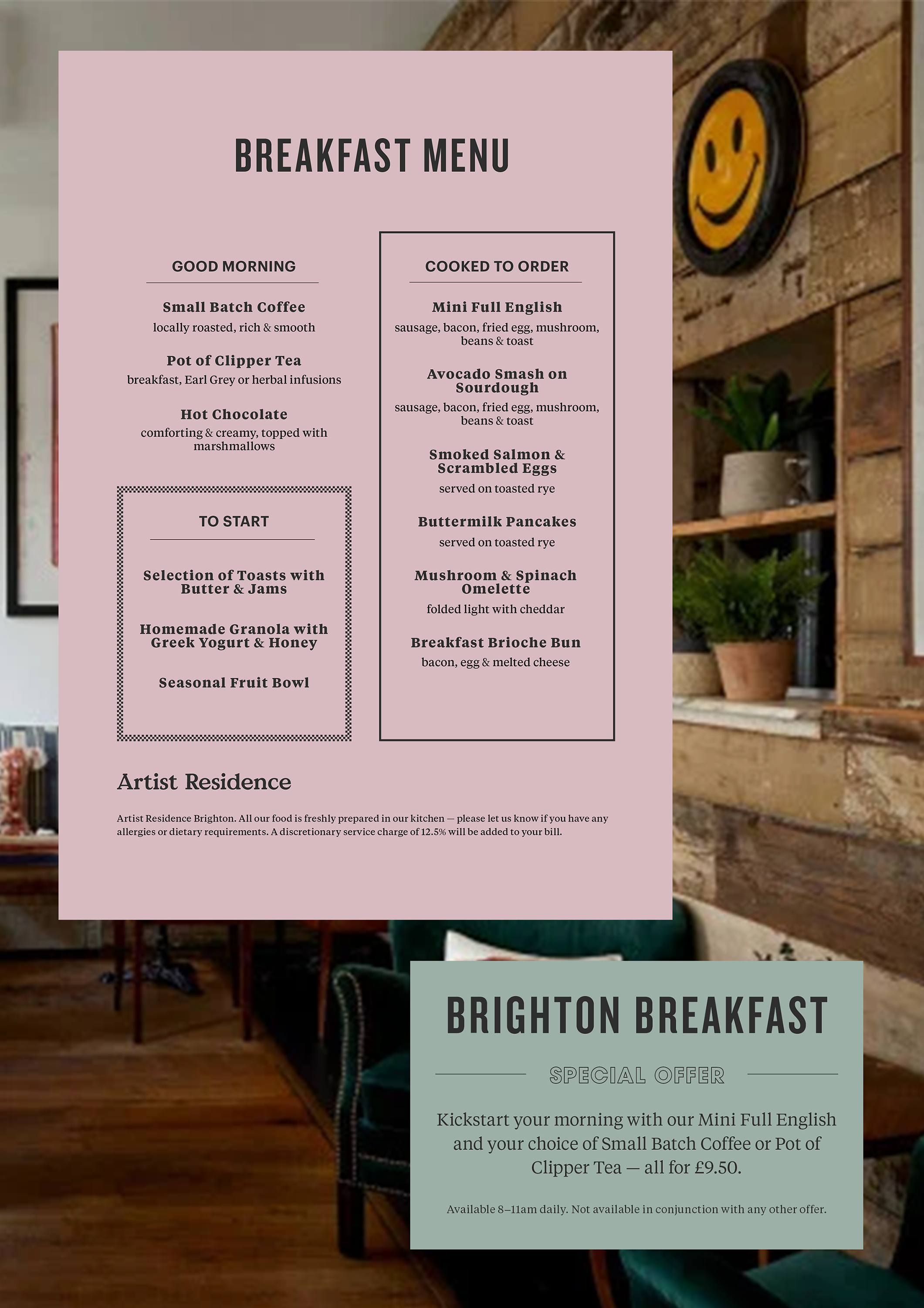
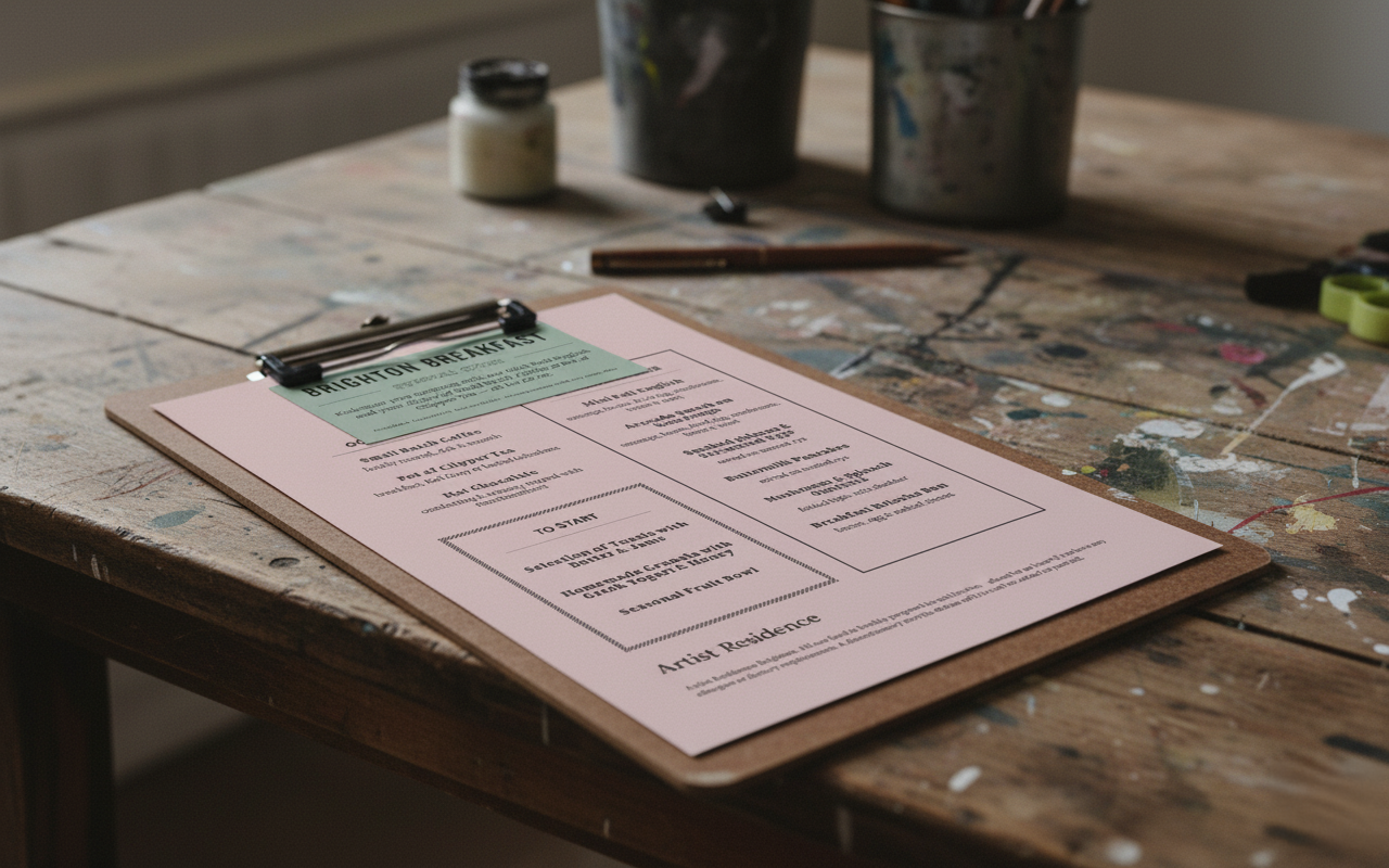
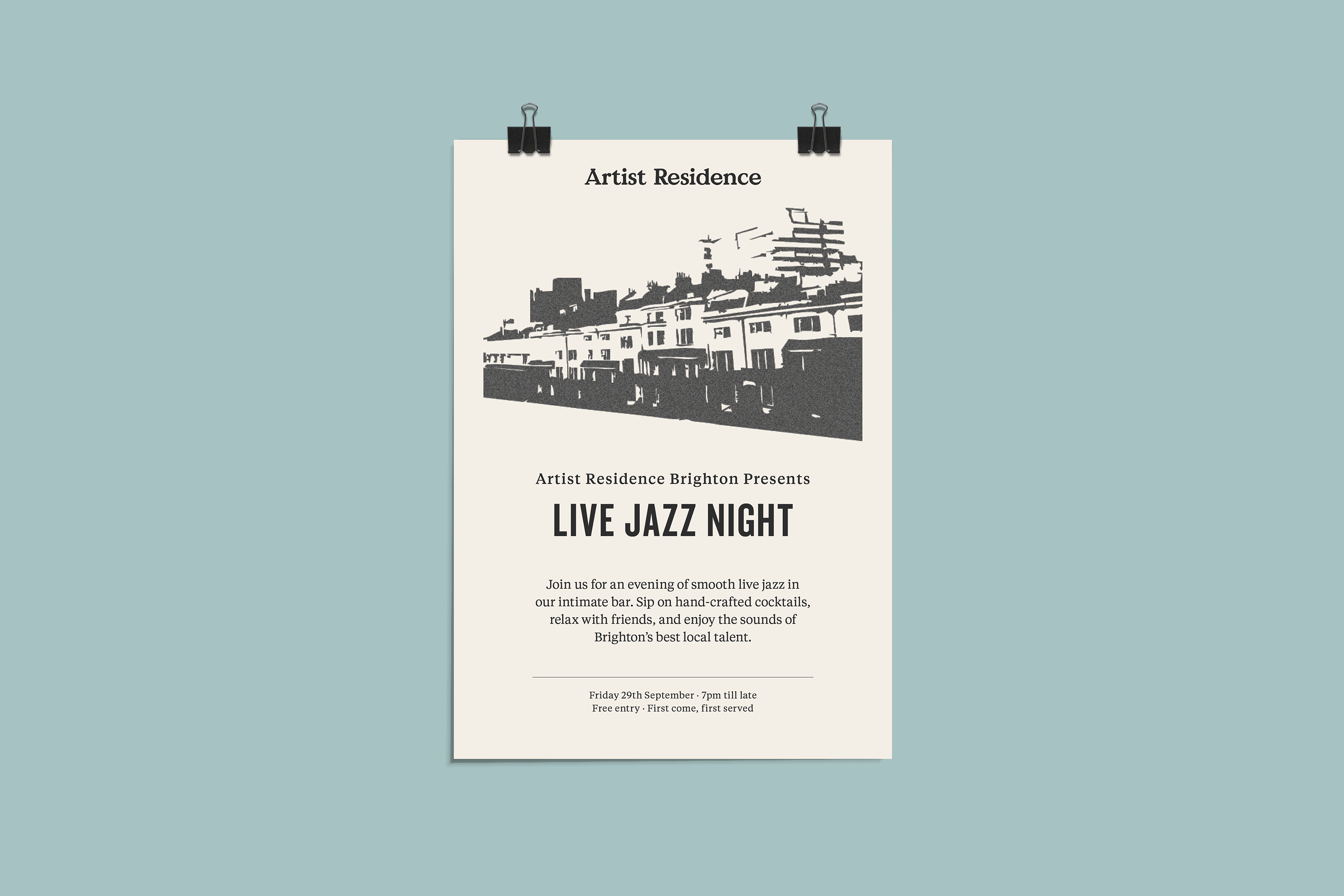
The printed materials for Artist Residence are designed to feel understated and tactile, aligning with the brand’s relaxed and unpretentious character. Layouts prioritise clarity, spacing, and restraint so that printed pieces sit naturally within the environment. This ensures the work supports the guest experience without drawing unnecessary attention to itself.
"".
"".
"".
"".

"".
.png)
"Editorial pieces extend the brand beyond function, capturing mood and narrative.".
"".
Editorial and lookbook-style layouts explore how the Artist Residence identity translates into longer-form storytelling. Pacing, whitespace, and typographic hierarchy are used to create calm continuity, allowing content and imagery to breathe. The layouts remain flexible rather than rigid, reflecting the brand’s balance between structure and informality.
"".
.png)
"".
.png)
"".
.png)