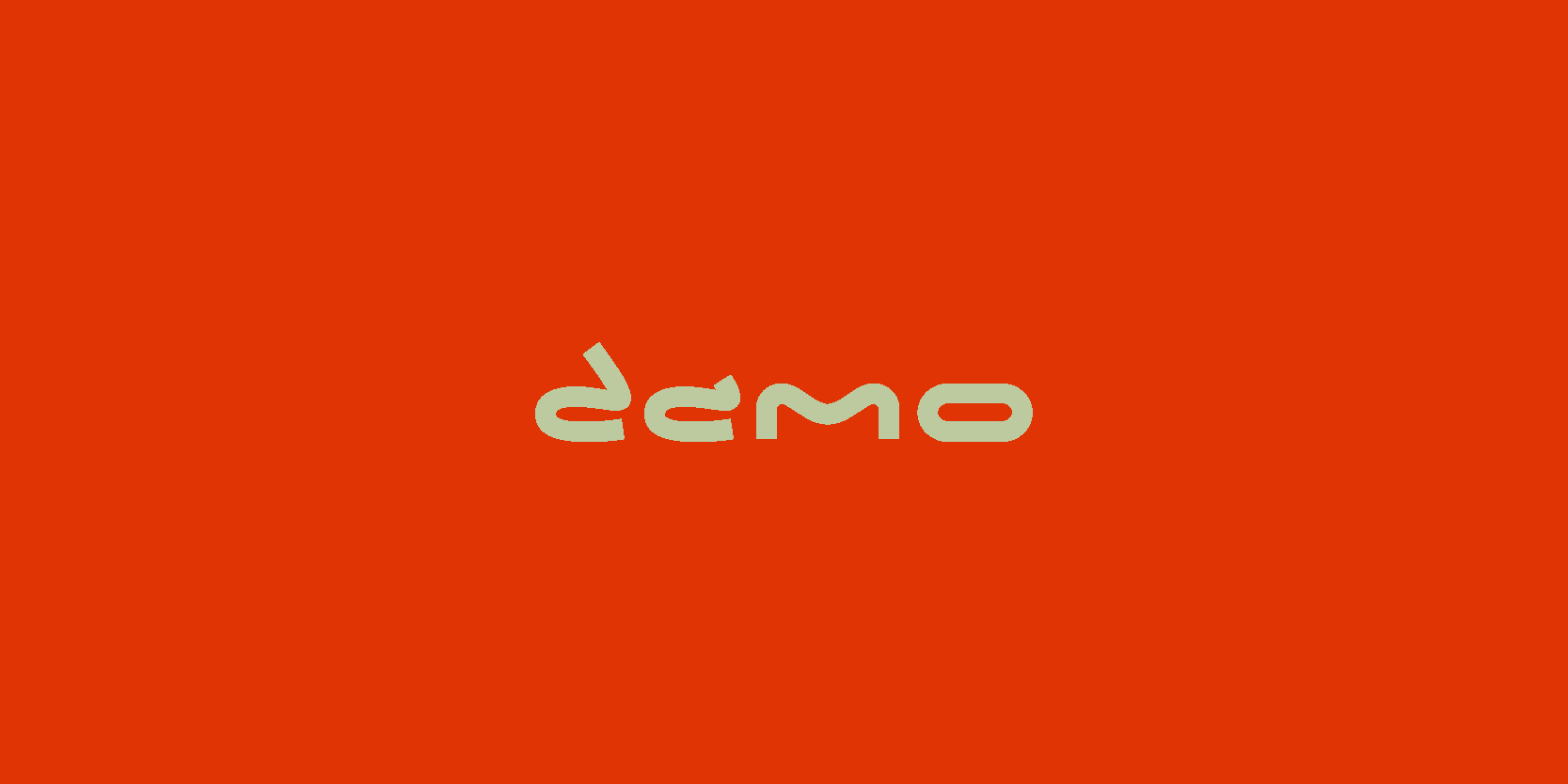
view case study
 

Damo Sounds

    • client
      Damo Sounds
    • date:
      2025
    • type:
      Branding
      Logo Design

"Sound as atmosphere. Music designed to feel lived-in, cinematic, and emotionally present across every touchpoint.".

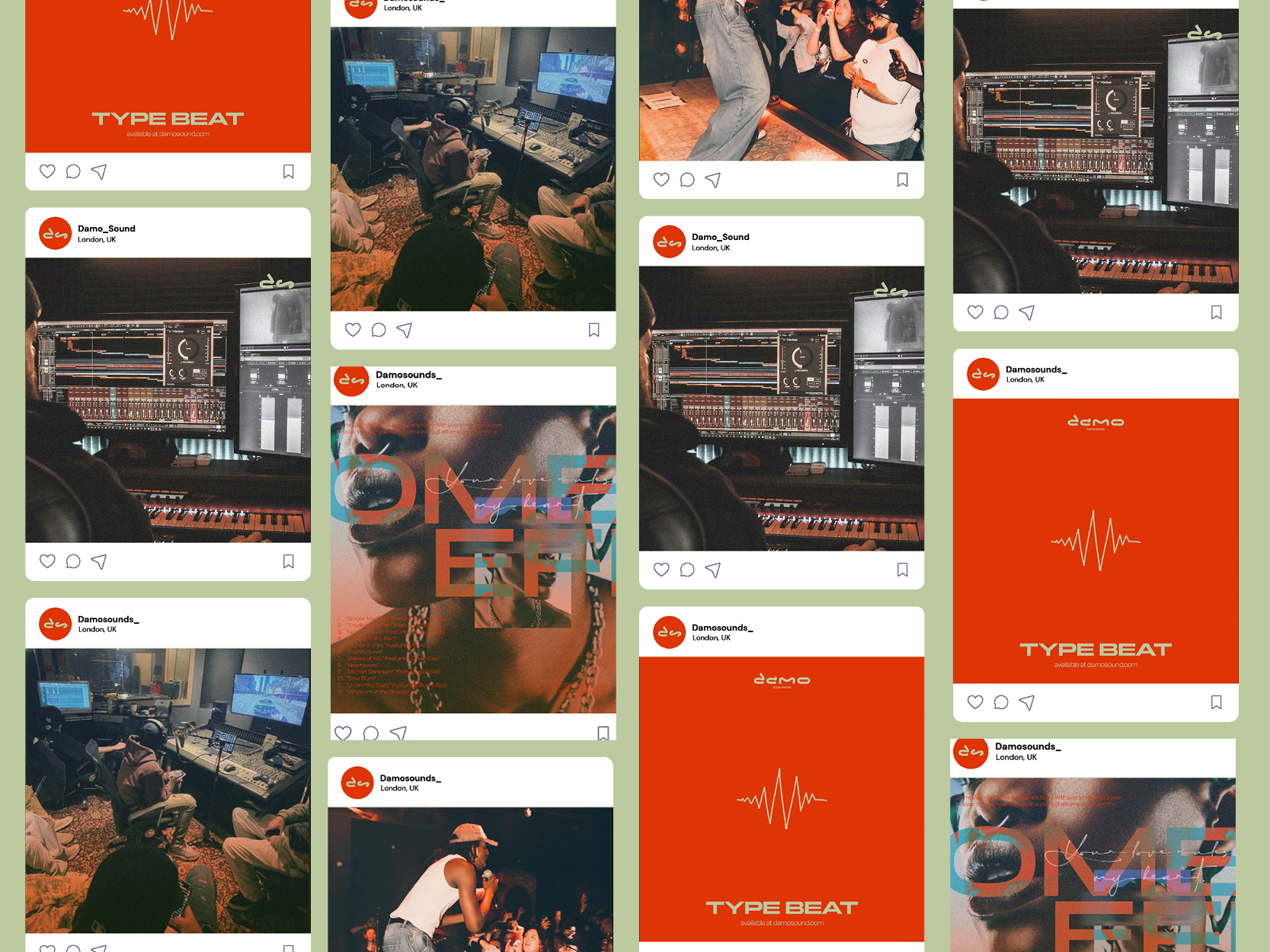
DamoSounds exists as a producer-led identity built around music that feels cinematic rather than transactional. The project translates sound into visual atmosphere, using texture, colour, and rhythm to mirror how the music moves between calm, tension, and release. Visual decisions were driven by emotion rather than genre, allowing gospel, drill, and instrumental forms to coexist without hierarchy. Typography behaves as image, motion reinforces pacing, and layouts prioritise mood over explanation. Together, the system frames DamoSounds as an evolving sonic world where each release feels intentional, immersive, and grounded in feeling rather than formula.

  • Project
    Damo Sounds
  • part:
    Damo Hero image

"".

  • project
    Damo Sounds
  • Process:
    Damo Hero image

  • Context:
    Damo Hero image
  • Chapter:
    Damo Hero image
  • Context:
    Damo Hero image
  • Project
    Damo Sounds
  • part:
    Brand Conceptualise

"".

  • project
    Damo Sounds
  • Process:
    Brand Conceptualise

The DamoSounds animation visually embodies the brand’s philosophy of music as more than just sound—it’s an experience. The animation begins with the logo being sketched in by hand, mimicking the organic, acoustic-driven nature of the beats and alluding to the brand’s drumming roots. This raw introduction transitions into an exclusion effect, revealing a dynamic collage of abstract imagery—moods, people, and scenes—building behind the logo in a seemingly random yet intentional way. This unpredictability mirrors the brand’s versatility and free-spirited approach to music, where emotions and storytelling take center stage. The moment of clarity comes when the visuals fade, leaving behind the DamoSounds logo in its brand colors, making a bold statement: beyond the artistic layers, this is the identity, the signature sound. By seamlessly blending motion, texture, and concept, the animation reinforces DamoSounds' mission—to craft music that is immersive, evocative, and undeniably distinct.

  • Context:
    Brand Conceptualise
  • Chapter:
    Brand Conceptualise
  • Context:
    Brand Conceptualise
  • Project
    Damo Sounds
  • part:
    Typography

"".

  • project
    Damo Sounds
  • Process:
    Typography

  • Context:
    Typography
  • Chapter:
    Typography
  • Context:
    Typography
  • Project
    Damo Sounds
  • part:
    Colour Palette

"".

  • project
    Damo Sounds
  • Process:
    Colour Palette

  • Context:
    Colour Palette
  • Chapter:
    Colour Palette
  • Context:
    Colour Palette
  • Project
    Damo Sounds
  • part:
    Impact

"This animation captures the pulse of DamoSounds — fluid, bold, and cinematic. Designed to move like the music itself, it sets the tone as a powerful intro for every track, instantly immersing the listener in the story before the beat even drops.".

  • project
    Damo Sounds
  • Process:
    Impact

  • Context:
    Impact
  • Chapter:
    Impact
  • Context:
    Impact
  • Project
    Damo Sounds
  • part:
    Logo

"".

  • project
    Damo Sounds
  • Process:
    Logo

  • Context:
    Logo
  • Chapter:
    Logo
  • Context:
    Logo
  • Project
    Damo Sounds
  • part:
    Animaion

"".

  • project
    Damo Sounds
  • Process:
    Animaion

  • Context:
    Animaion
  • Chapter:
    Animaion
  • Context:
    Animaion
  • Project
    Damo Sounds
  • part:
    Album Art

"".

  • project
    Damo Sounds
  • Process:
    Album Art

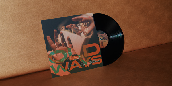
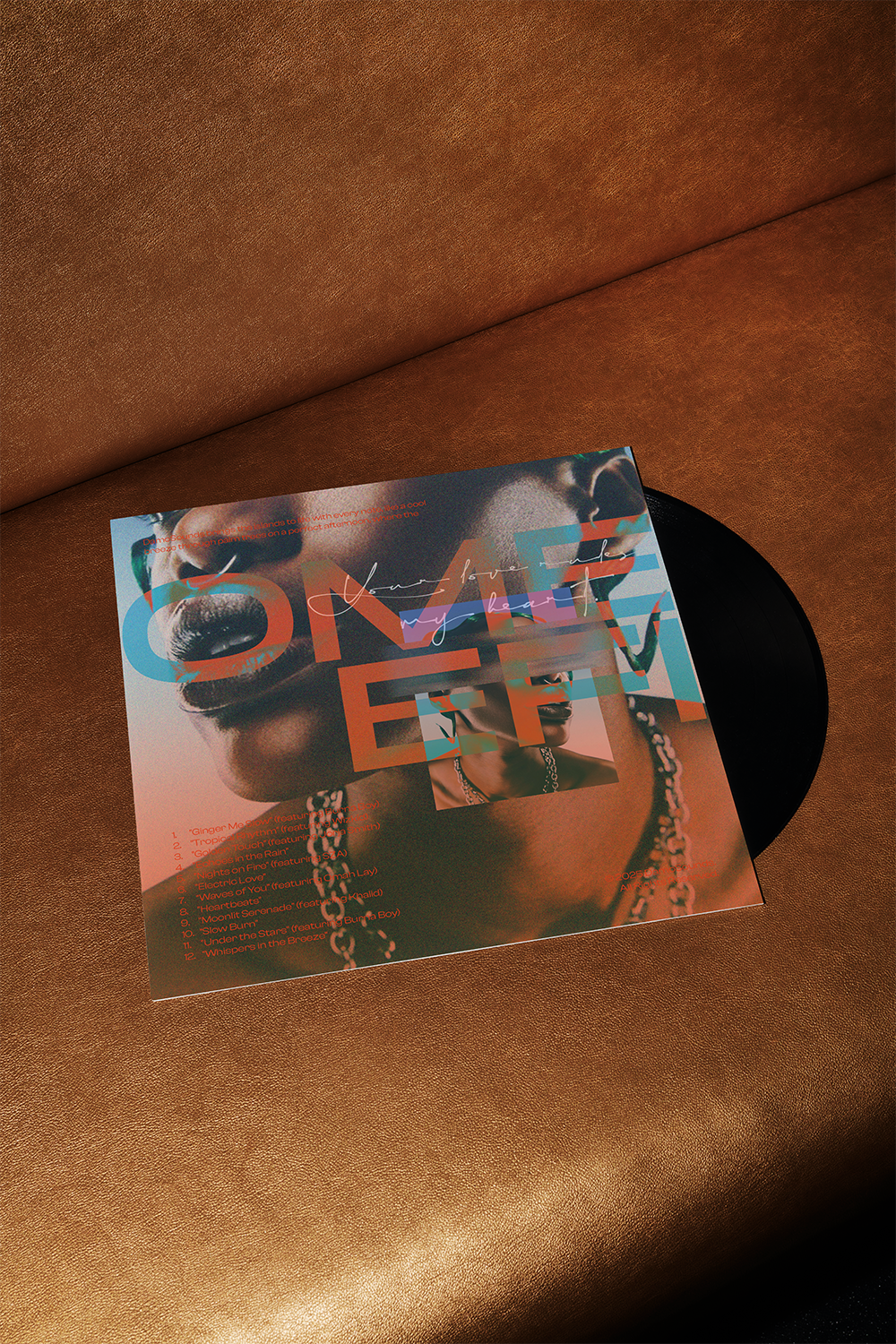
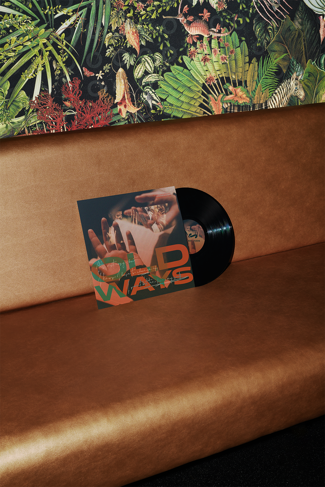
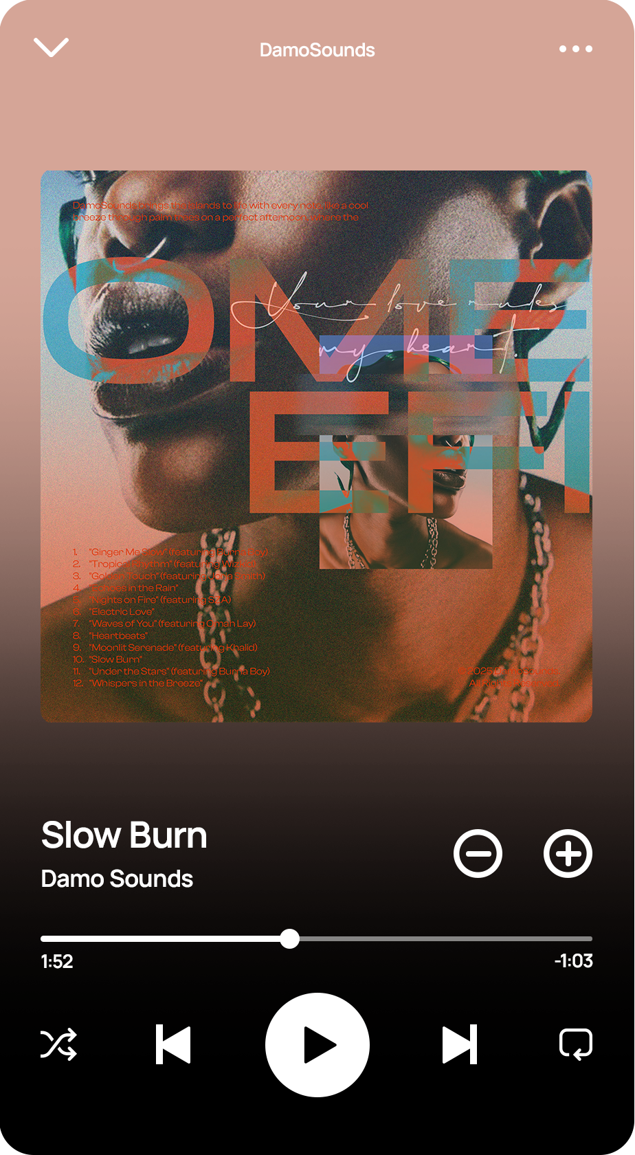
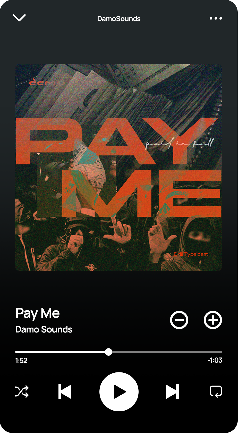
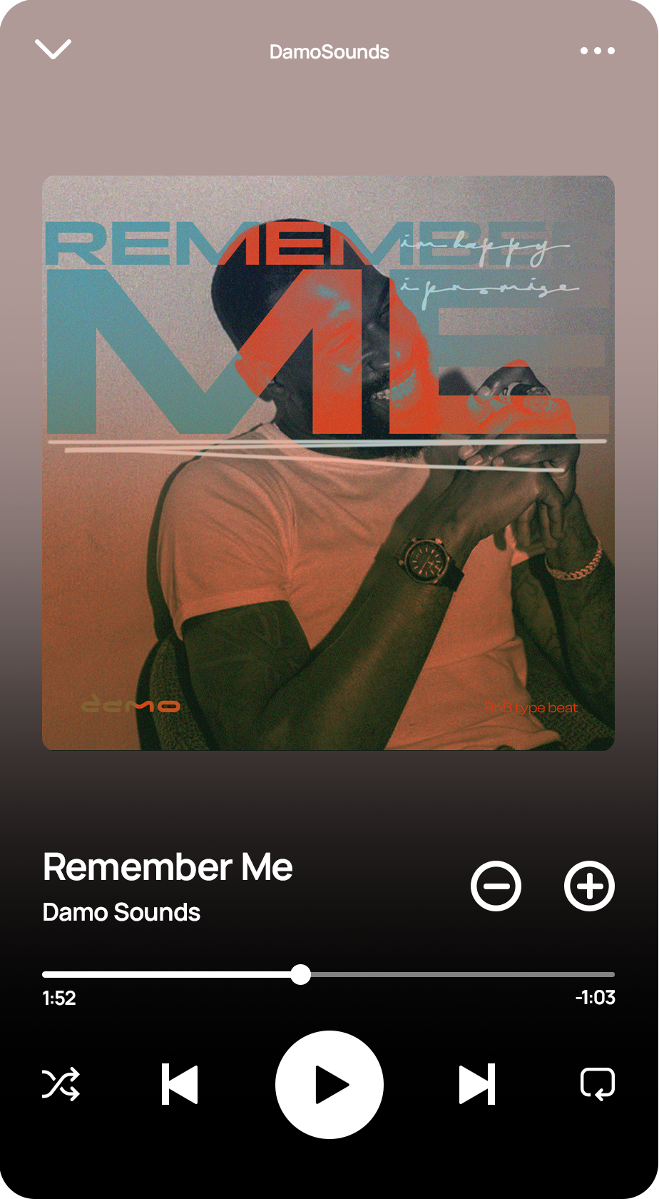
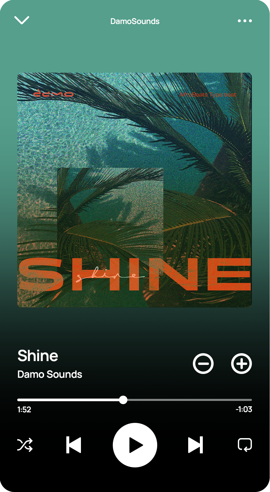
DamoSounds embraces the artistic, organic essence of its sound by integrating bold typography, expressive textures, and immersive imagery into its visual identity. Song titles take on a striking presence using Panchang in bold, while Southera injects raw energy for suggestive text, adding a sense of freedom and spontaneity. A subtle grain effect enhances depth, making covers and artwork feel tactile and experiential. Paired with layered overlays for contrast, these elements transform music visuals into an extension of the sound itself—immersive, unconventional, and undeniably DamoSounds.

  • Context:
    Album Art
  • Chapter:
    Album Art
  • Context:
    Album Art
  • Project
    Damo Sounds
  • part:
    Album Covers Omefi

"".

  • project
    Damo Sounds
  • Process:
    Album Covers Omefi

  • Context:
    Album Covers Omefi
  • Chapter:
    Album Covers Omefi
  • Context:
    Album Covers Omefi
  • Project
    Damo Sounds
  • part:
    Album Covers Old Ways

"".

  • project
    Damo Sounds
  • Process:
    Album Covers Old Ways

  • Context:
    Album Covers Old Ways
  • Chapter:
    Album Covers Old Ways
  • Context:
    Album Covers Old Ways
  • Project
    Damo Sounds
  • part:
    Album Covers Showcase

"".

  • project
    Damo Sounds
  • Process:
    Album Covers Showcase

  • Context:
    Album Covers Showcase
  • Chapter:
    Album Covers Showcase
  • Context:
    Album Covers Showcase
  • Project
    Damo Sounds
  • part:
    Spotify Usage

"".

  • project
    Damo Sounds
  • Process:
    Spotify Usage

  • Context:
    Spotify Usage
  • Chapter:
    Spotify Usage
  • Context:
    Spotify Usage
  • Project
    Damo Sounds
  • part:
    Social Media

"".

  • project
    Damo Sounds
  • Process:
    Social Media

  • Context:
    Social Media
  • Chapter:
    Social Media
  • Context:
    Social Media
    • next project
    • client
.
Branding
Logo Design