Revive is a skincare brand
dedicated to restoring the
skin's natural balance and
enhancing its radiance.
Founded on the belief that true beauty starts from within, our products nourish the skin with natural ingredients, helping it thrive and glow.Targeting women aged 25-45 in urban areas, our brand appeals to those who value health-conscious and gentle skincare.
Our goal is to become a trusted name in the industry by offering high-quality, affordable, and effective products.With a calm, reassuring, and knowledgeable tone, we aim to educate and build a community around natural skincare. Our visual identity will be modern and minimalistic, using earthy tones to reflect our commitment to natural beauty.


Revive’s design embraces
femininity with elegance,
blending natural themes
for a subtle, empowering
look.
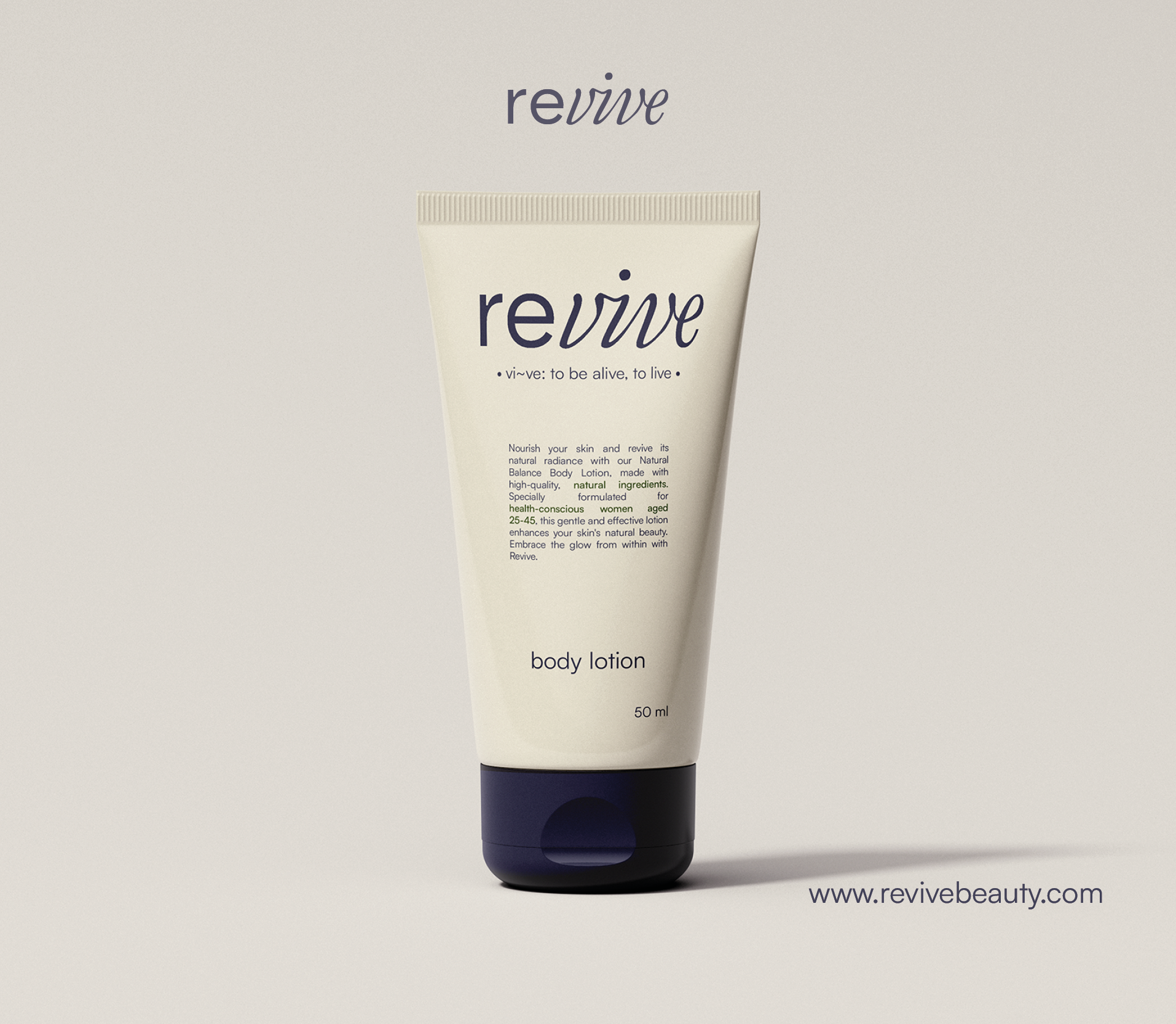
With Revive, I deliberately avoided using leavesor overtly natural motifs, as they often steer thedesign toward green tones. Instead, I focusedon a palette of soft nude shades with a subtledash of blue to evoke calmness and elegancewithout leaning on the obvious. For the logo, I combined a dominant italic script font with asecondary sans-serif typeface, striking a perfectbalance between femininity and modernity.This thoughtful contrast gave the logo itsunique character, blending timeless grace witha contemporary edge, while the refined colorpalette completed the aesthetic with subtlesophistication.

Revive’s design uses white
space and hierarchy to
create a modern, elegant
femininity through
simplicity.


For the Revive website, our primary focus wason creating a user-friendly experience tailoredto women. We wanted the site to be effortlessto navigate and visually captivating, so weincorporated a nude-colored background thatimmediately catches the eye while remainingsoft and inviting. The design strictly adheres tothe brand’s color theme, ensuring consistencyand harmony throughout.
The call-to-action buttons are simple yeteffective, guiding users seamlessly withoutoverwhelming the interface. For typography,we opted for the Satoshi font—modern,approachable, and versatile. While geometricin style, it complements the aesthetic beautifullyand enhances readability. Every detail of thewebsite was crafted to blend functionality withelegance, delivering a cohesive and enjoyableuser experience.


